ishtyle
AI-powered fashion app that recommends outfits based on users' wardrobe, occasion, weather, and mood. Designed high-fidelity mobile screens and refined flows based on user testing.
Explore DetailsProduct & Brand Experience Designer
A multidisciplinary designer specializing in the consumer space, delivering everything from polished design systems to production-ready code.
AI-powered fashion app that recommends outfits based on users' wardrobe, occasion, weather, and mood. Designed high-fidelity mobile screens and refined flows based on user testing.
Explore DetailsCommunity platform for eco-enthusiasts to share sustainability goals, inspiration, and everyday practices. Mapped user flows, prototyped layouts, and validated interactions.
Explore DetailsBook tracking platform for managing reading progress, organizing personal libraries, and writing reviews. Crafted interactive prototypes and mapped user journeys.
Explore DetailsSolo travel planning app for creating itineraries, discovering destinations, and simplifying trip bookings through user-centered navigation and layouts.
Explore DetailsBrand Style Guide & Fashion Editorial Lookbook created to establish a cohesive visual identity and showcase seasonal collections through premium storytelling.
Explore DetailsHello, I’m Harshitha (Asha) Rajendran. I design digital experiences where brand narrative meets flawless execution. My path to product design wasn’t typical, and that’s my greatest asset. I started in Fashion Technology and Management, where I spent years decoding consumer desires, mastering visual merchandising, and obsessing over systemic quality control down to the millimeter. I learned early on that an exceptional experience is a meticulous blend of emotional storytelling and strict functional standards.
Today, I bridge the gap between design and development. As a Product & Brand Experience Designer, I don’t just hand off flat UI layouts in Figma; I build, test, and iterate on actual mobile and web interfaces using SwiftUI, Kotlin, and React. Whether conducting dozens of deep-dive user interviews to build an AI stylist app (like ishtyle) or optimizing conversion funnels that generate thousands of leads and sales for e-commerce brands, I bring a grounded, data-driven approach to human-centered design.
The superpower I bring to your team: I am a practical systems thinker. I love the messy chaos of inventing new concepts, but my true zone of genius is bringing structure to that chaos, transforming big, abstract strategies into sustainable, highly polished, and meticulously executed digital realities.
When I’m not designing: You’ll likely find me capturing stories through a camera lens (PSI award-winner!), nose-deep in a fantasy book, writing poetry, or advocating for inclusive, accessible, and ethical technology.
Download my full resume document to view detailed timelines, projects context, and professional methodologies.
Have an exciting project you want to collaborate on or a question about my design and brand experience services? Reach out directly via email or connect with me on social media. Let's build something exceptional.
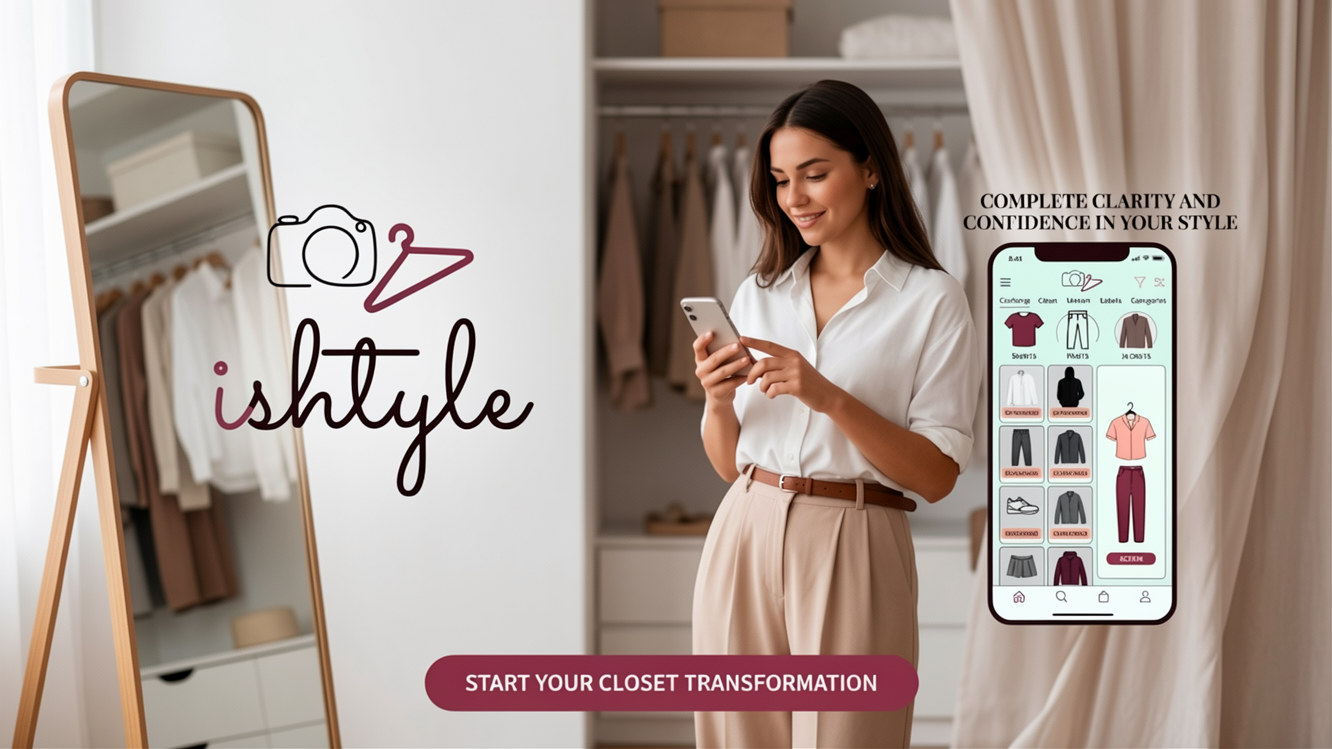
AI-powered fashion ecosystem seamlessly digitizing physical closets to deliver personalized outfit recommendations
Tagline: Your wardrobe. Your stylist. Your confidence.
Role: Lead UX/UI Designer & Android Engineer
Focus: Minimalist closet management and AI style matchmaking.
Role: Product Design & Android Dev
Duration: 4 Weeks
Tools: Figma, Android Studio, Kotlin
Users face significant morning decision fatigue. Despite full closets, they feel they "have nothing to wear," struggle with impulse shopping/duplicate purchases, lack general styling confidence, have difficulty identifying cuts matching their body shape, and contribute to environmental fashion waste.
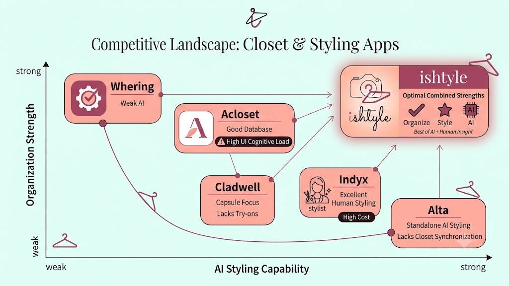
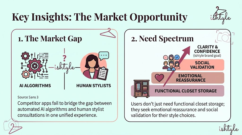
I analyzed leading closet apps: Whering (strong organization, weak AI), Acloset (good database, high UI cognitive load), Cladwell (capsule focus, lacks try-ons), Indyx (excellent human styling, high cost), and Alta (standalone AI styling, lacks closet synchronization). ishtyle combines the strengths of all these approaches.
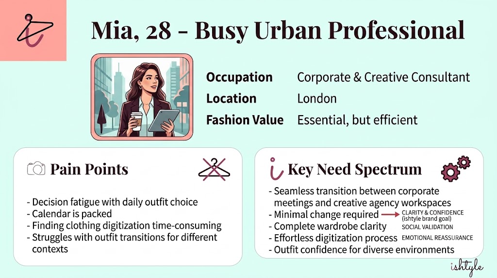
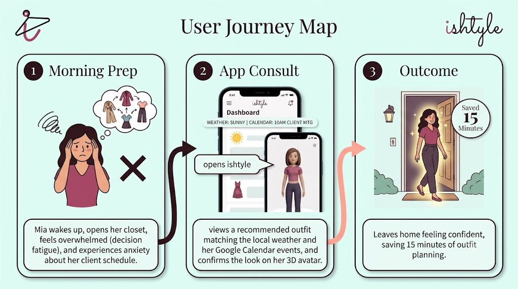
Mia, 28 - Busy Urban Professional: Mia values fashion but suffers from decision fatigue. Her calendar is packed, and she needs to transition seamlessly between corporate meetings and creative agency workspaces without changing outfits.
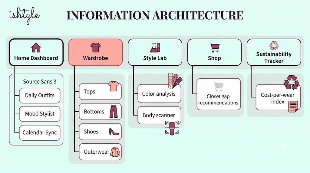
The app structure features five primary tabs: Home Dashboard (Daily Outfits, Mood Stylist, Calendar Sync), Wardrobe (Tops, Bottoms, Shoes, Outerwear), Style Lab (Color analysis, Body scanner), Shop (Closet gap recommendations), and Sustainability Tracker (Cost-per-wear index).
ishtyle (Root) │ ├── 📁 app/src/main │ ├── 📁 java/com/example/ishtyle/ │ │ ├── MainActivity.kt # Entry navigation coordinating views │ │ └── 📁 ui/ │ │ ├── BrandLogos.kt # Vector image rendering modules │ │ └── 📁 theme/ │ │ ├── Color.kt # Brand color palette variables │ │ ├── Theme.kt # Light/Dark scheme configurations │ │ └── Type.kt # Typography definition for custom fonts │ │ │ └── 📁 res/ │ └── 📁 font/ # Variable TTF files (Playfair & Source Sans) │ └── 📁 gradle/ # Version catalogs
For modularity, we represented clothing properties using a lightweight Kotlin data model to hold digitizing attributes:
data class WardrobeItem( val id: String, val name: String, val category: String, val itemType: String, // "shirt", "pants", "shoes", "jacket" val color: String = "Neutral", val season: String = "All", val occasion: String = "Casual", val isFavorite: Boolean = false, val isNew: Boolean = false )
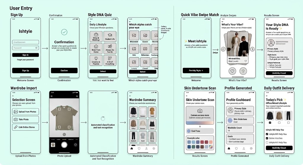
Sign Up ➔ Style DNA Quiz ➔ Quick Vibe Swipe Match ➔ Skin Undertone Scan ➔ Wardrobe Import ➔ Profile Generated ➔ Daily Outfit Delivery.
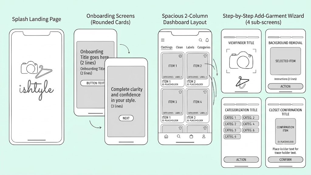
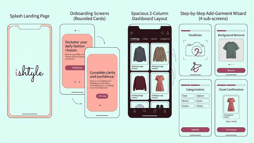
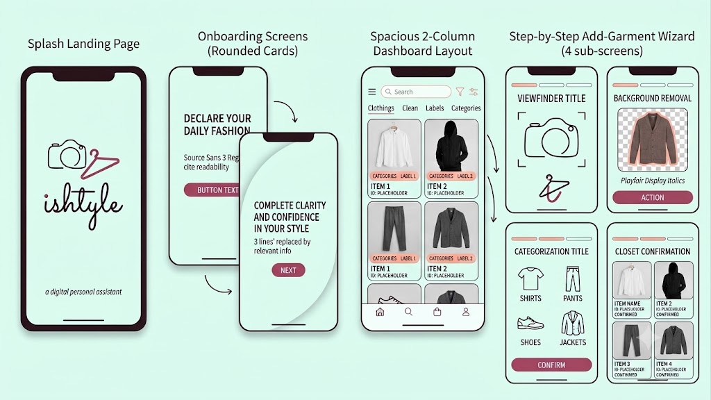
Designed a clean mobile wireframe hierarchy: a splash landing page featuring the cursive wordmark, onboarding screens utilizing rounded cards, a spacious 2-column dashboard layout, and a step-by-step add-garment wizard (Viewfinder, Background Removal, Categorization, and Closet Confirmation).
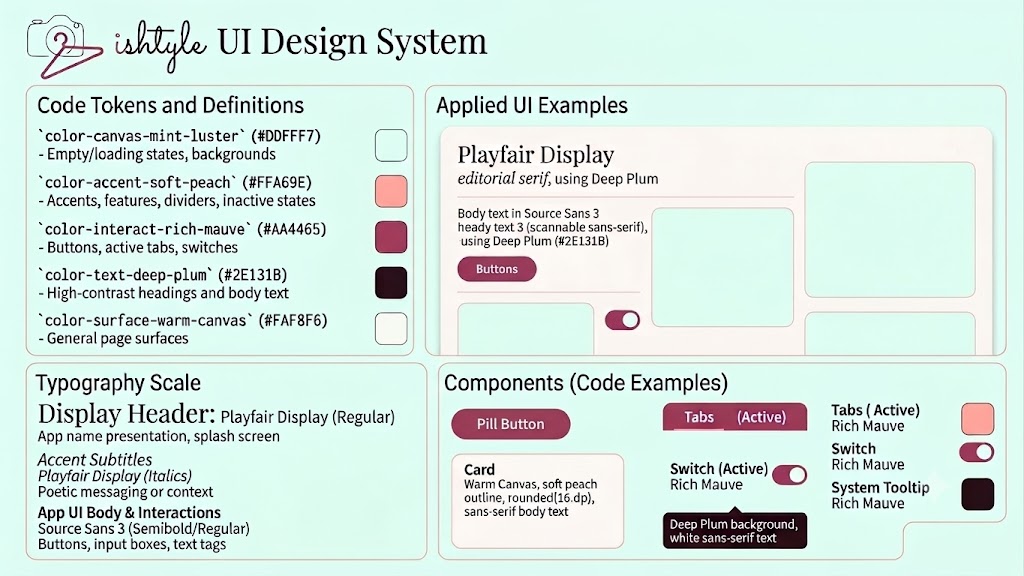
Defined brand styles in code: Mint Luster (#DDFFF7) for backgrounds/canvas, Soft Peach (#FFA69E) for borders/dividers, Rich Mauve (#AA4465) for buttons/CTAs, Deep Plum (#2E131B) for typography structure, and Warm Canvas (#FAF8F6) for page surfaces. Fonts pair editorial Playfair Display with readable Source Sans 3.
Refined high-fidelity components to feature flat cards with micro-thin borders instead of heavy shadows, clean icons representing shirts/pants/shoes/jackets, and spacious, decluttered grids where garments are the heroes.
To align with our minimalism pillar, I implemented the custom vector outline draw methods using Jetpack Compose Canvas path structures:
@Composable fun ShirtOutlineDrawing(color: Color) { Canvas(modifier = Modifier.size(64.dp)) { val w = size.width val h = size.height val stroke = 2.5.dp.toPx() val path = Path().apply { moveTo(w * 0.4f, h * 0.15f) quadraticTo(w * 0.5f, h * 0.22f, w * 0.6f, h * 0.15f) lineTo(w * 0.8f, h * 0.25f) lineTo(w * 0.9f, h * 0.4f) lineTo(w * 0.8f, h * 0.45f) lineTo(w * 0.75f, h * 0.38f) lineTo(w * 0.75f, h * 0.85f) lineTo(w * 0.25f, h * 0.85f) lineTo(w * 0.25f, h * 0.38f) lineTo(w * 0.2f, h * 0.45f) lineTo(w * 0.1f, h * 0.4f) lineTo(w * 0.2f, h * 0.25f) close() } drawPath(path, color = color, style = Stroke(width = stroke)) } }
For the background removal step of the digitization wizard, I designed a custom Composable that uses infinite animations to render a scanning laser overlay and a mathematically calculated transparency grid:
@Composable fun RemoveBackgroundStep( garmentType: String, smoothEdges: Float, refinement: Float, onSmoothChange: (Float) -> Unit, onRefinementChange: (Float) -> Unit, onConfirm: () -> Unit ) { // Infinite transition for real-time laser/scanner effect val infiniteTransition = rememberInfiniteTransition(label = "scan_laser") val scanY by infiniteTransition.animateFloat( initialValue = 0.05f, targetValue = 0.95f, animationSpec = infiniteRepeatable( animation = tween(durationMillis = 2000, easing = LinearEasing), repeatMode = RepeatMode.Reverse ), label = "laser_pos" ) Column(modifier = Modifier.fillMaxSize().padding(24.dp)) { Box(modifier = Modifier.fillMaxWidth().weight(1f)) { // Checkerboard transparency canvas Canvas(modifier = Modifier.fillMaxSize()) { val cols = 20 val rows = 30 val boxW = size.width / cols val boxH = size.height / rows for (r in 0 until rows) { for (c in 0 until cols) { if ((r + c) % 2 == 0) { drawRect( color = Color(0xFFF3F1EF), topLeft = Offset(c * boxW, r * boxH), size = Size(boxW, boxH) ) } } } } // Render laser scanner line Canvas(modifier = Modifier.fillMaxSize()) { val lineY = size.height * scanY drawLine( color = RichMauve.copy(alpha = 0.8f), start = Offset(12.dp.toPx(), lineY), end = Offset(size.width - 12.dp.toPx(), lineY), strokeWidth = 3.dp.toPx(), cap = StrokeCap.Round ) } } } }
Designed a fully functional interactive prototype flow in Jetpack Compose: Splash delay transition, swipeable onboarding pages, active grid categories, and a multi-step camera digitization wizard complete with a shutter flash animation and laser scanner overlay.
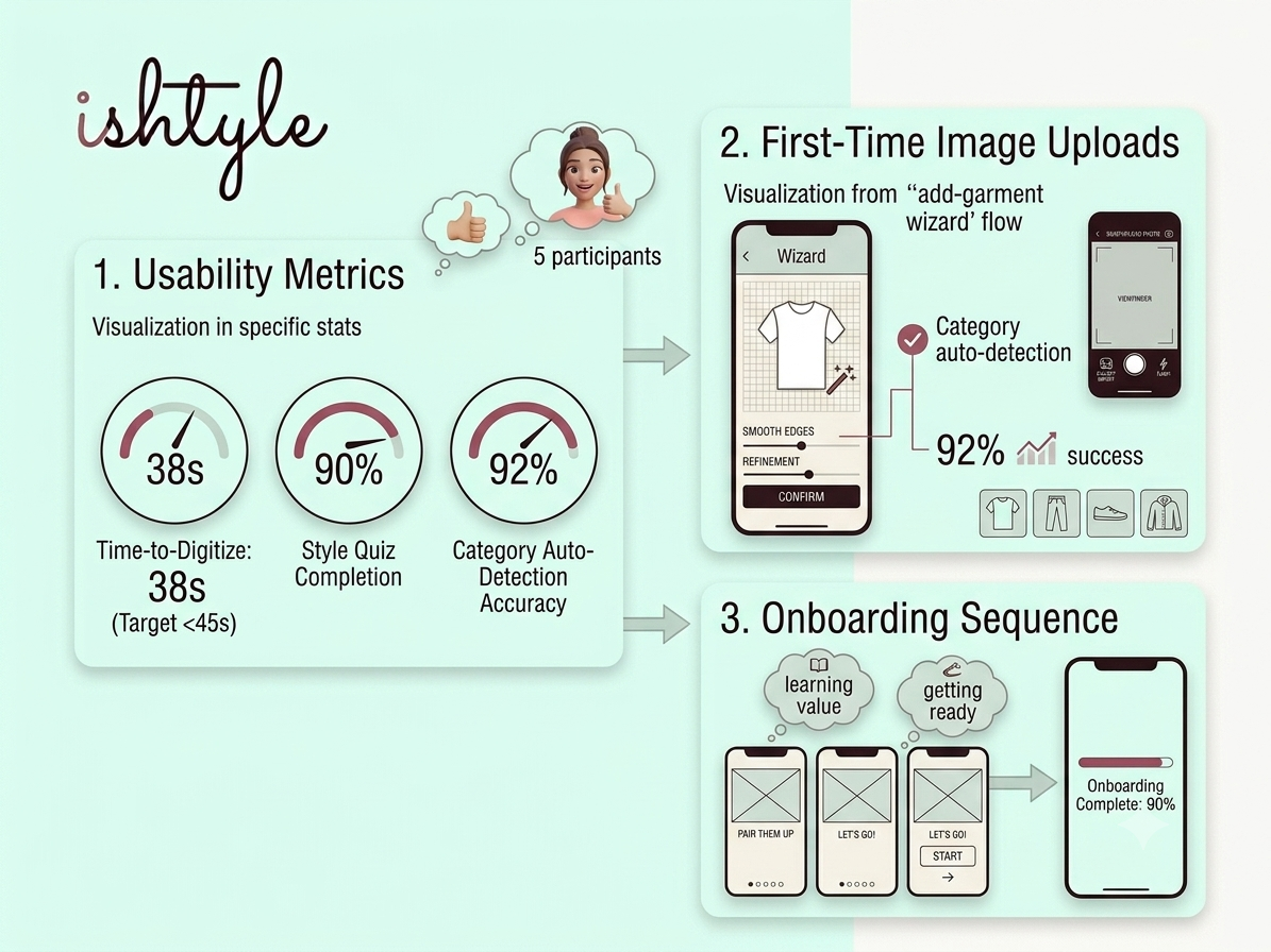
Tested with 5 participants: Time-to-Digitize averaged 38 seconds (exceeding target of <45s), Style Quiz Completion sat at 90%, and Category auto-detection accuracy achieved 92% success during initial image uploads.
Combining design systems with functional code structures early avoids layout regression. High-fashion aesthetics (like editorial typography and a custom warm palette) elevate the utility from a simple closet inventory list to a desirable, daily lifestyle companion.
Building a community that makes sustainable living feel social
EcoCycle is a community-driven platform designed for people who want to live more sustainably. While many sustainability apps focus on tracking habits, EcoCycle encourages users to connect, share progress, exchange resources, and stay motivated through a supportive community. For this project, I focused on designing a personalized profile experience that helps users showcase their sustainability journey while encouraging meaningful community engagement.
Role: UX Research • Product Design • UI Design
Duration: 4 Weeks
Tools: Figma • FigJam • Miro
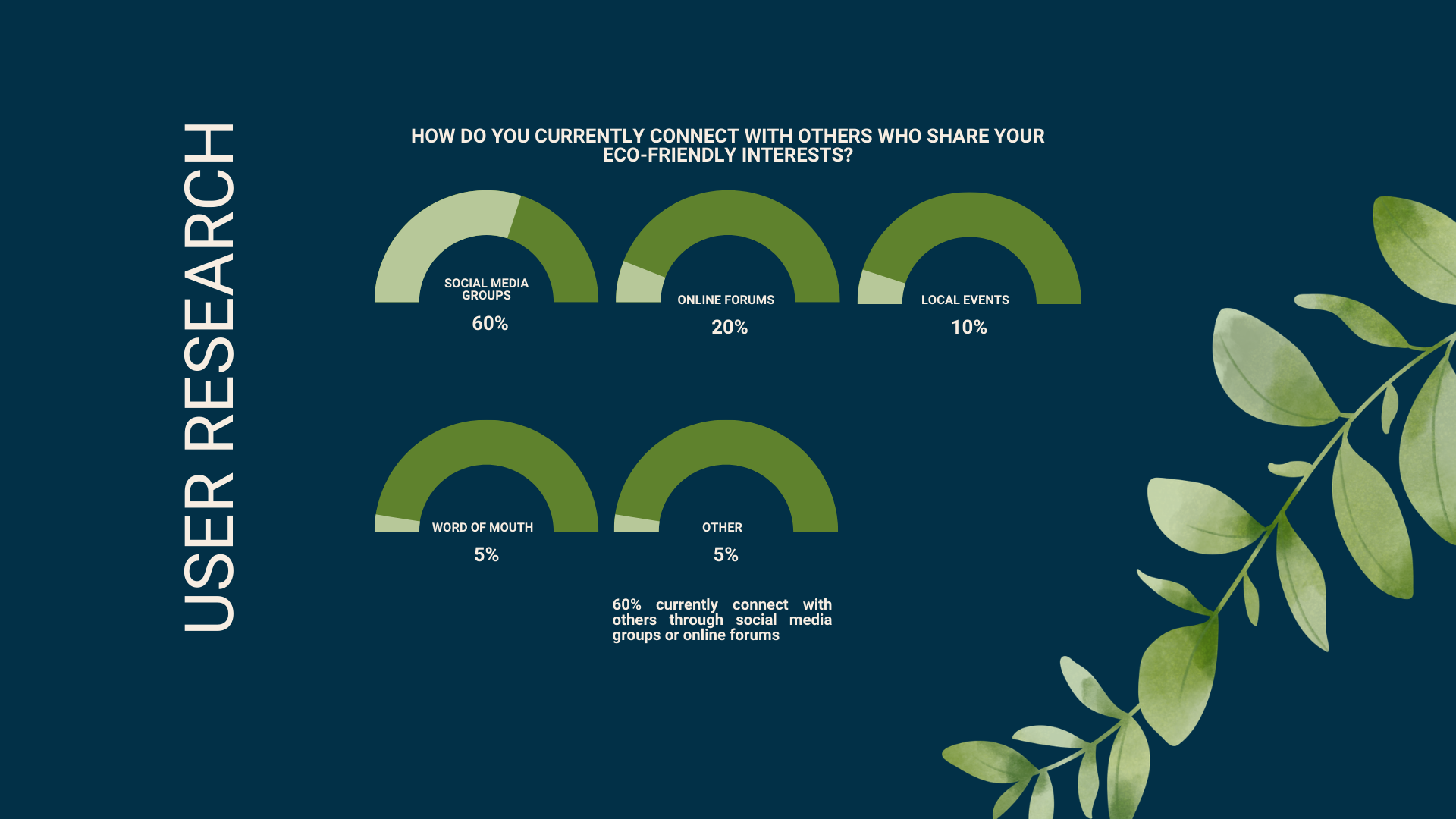
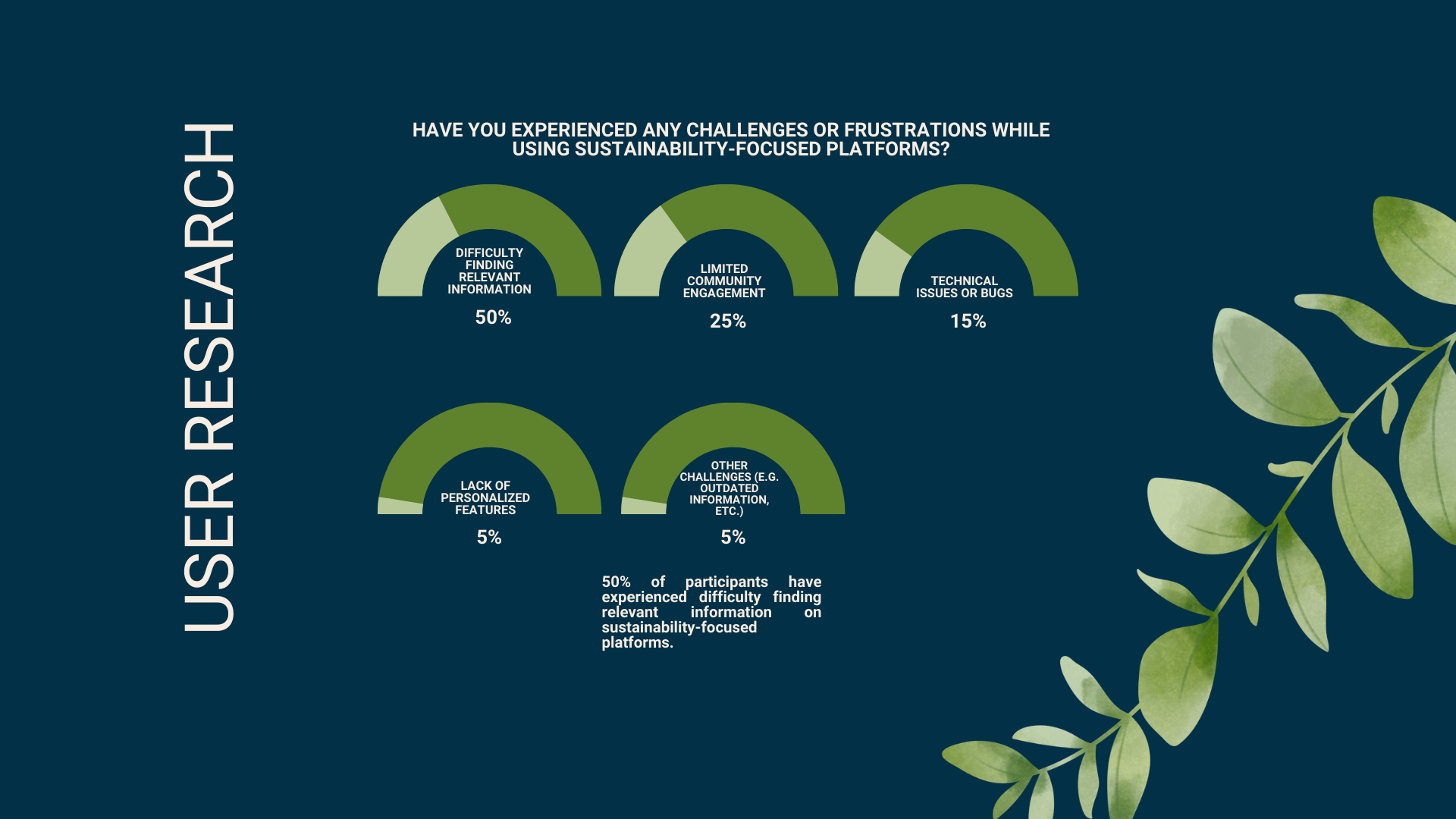
People who care about sustainability often rely on scattered resources such as social media groups, forums, and blogs to learn and connect with others. Existing platforms make it difficult to discover relevant information, celebrate personal progress, or build lasting relationships with like-minded individuals.
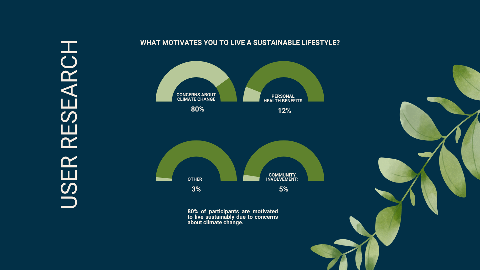
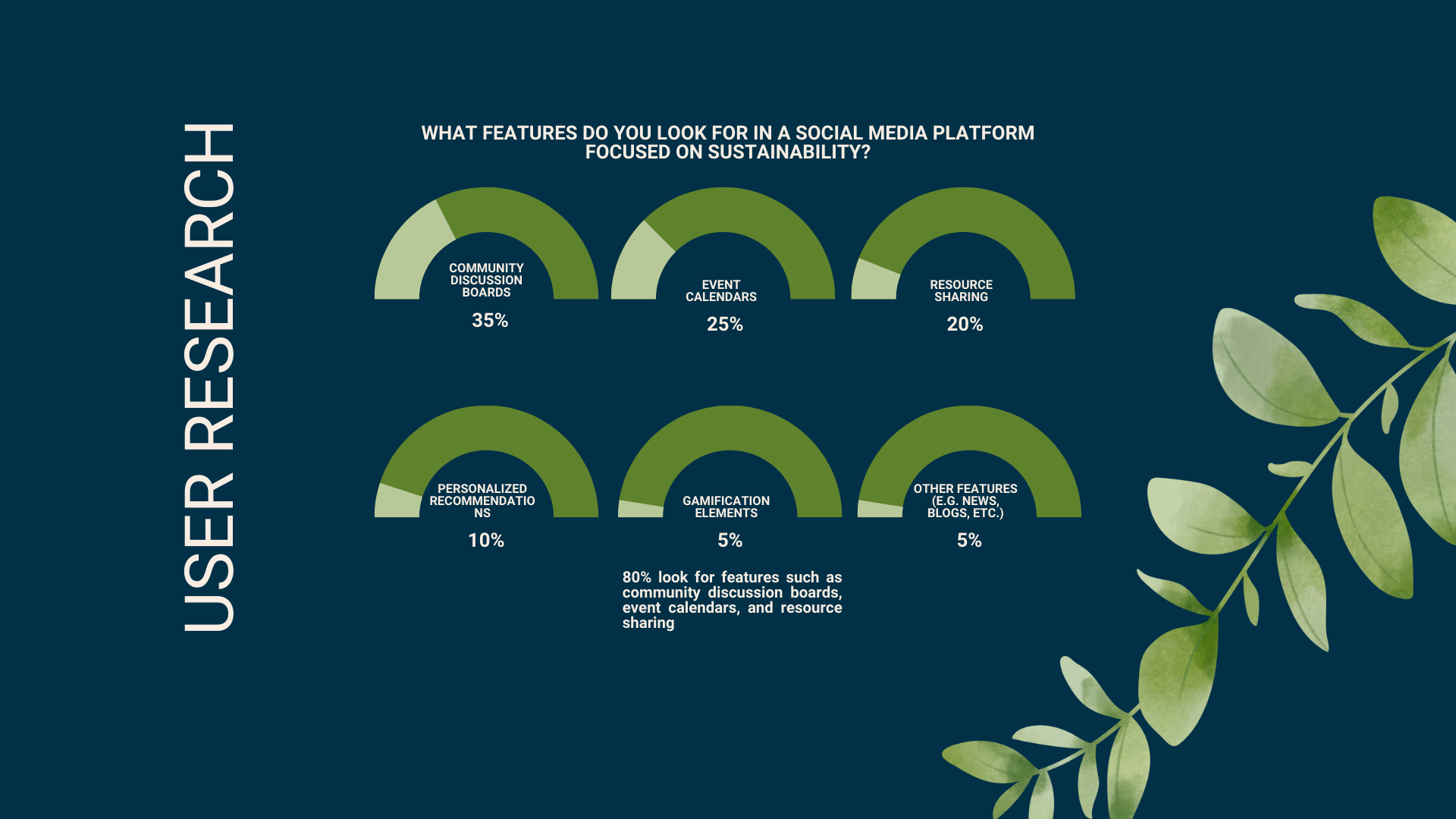
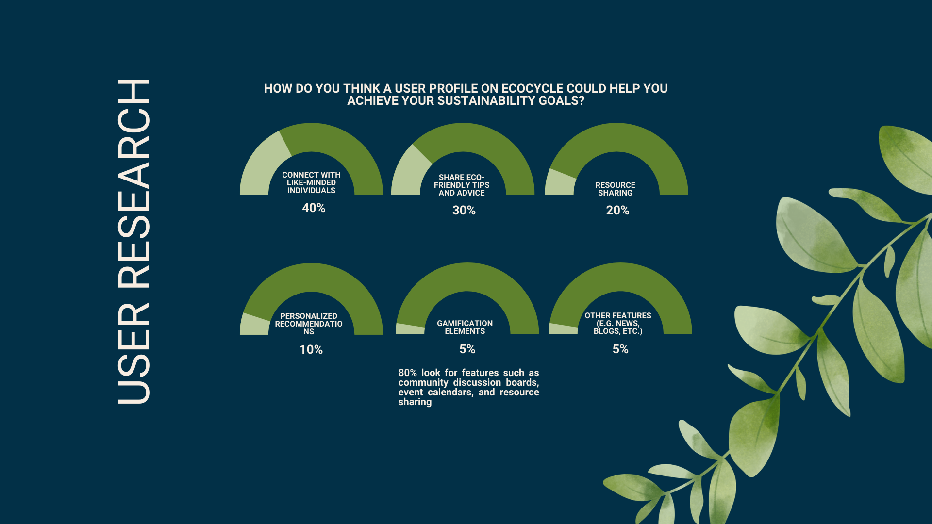
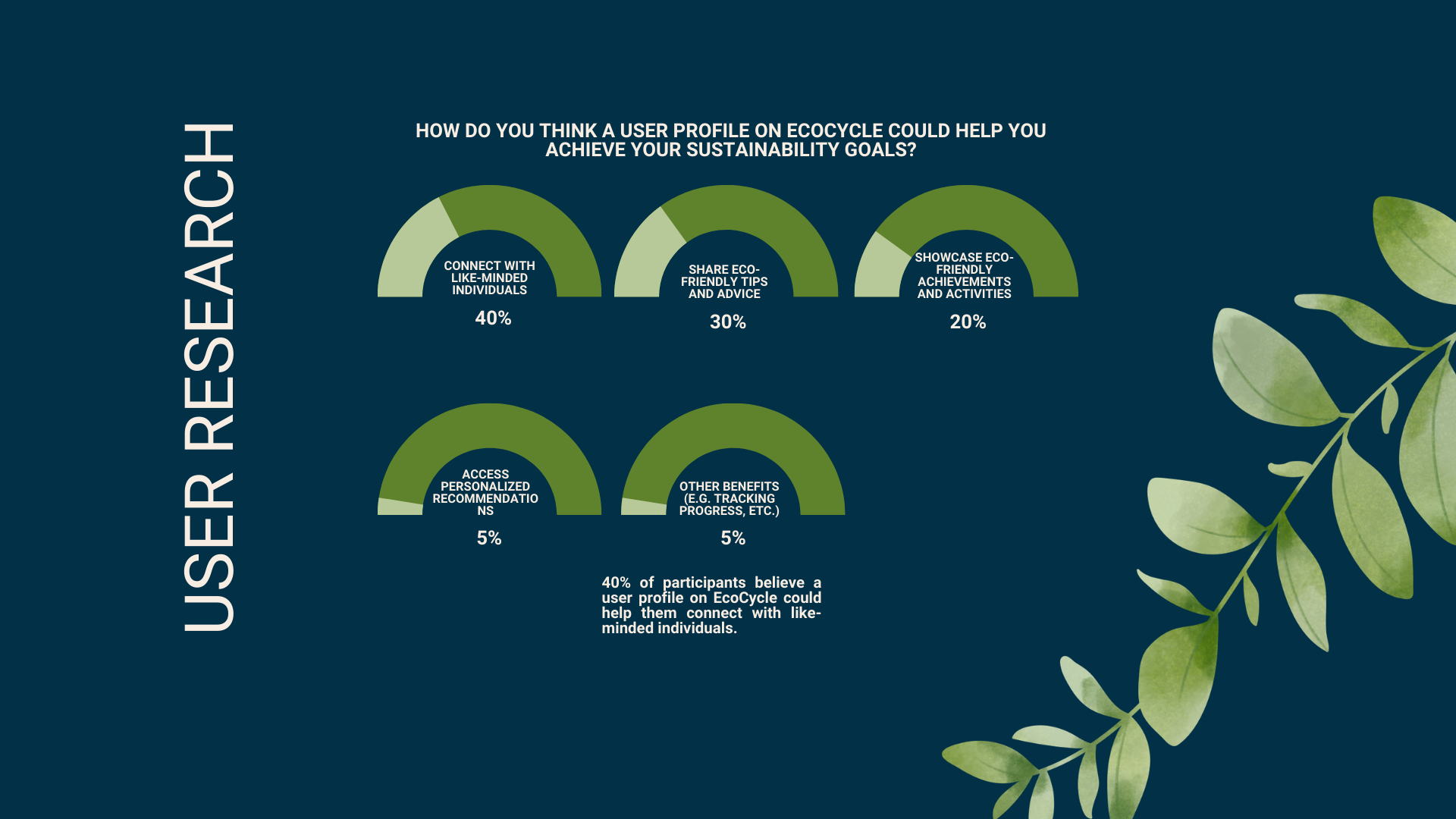
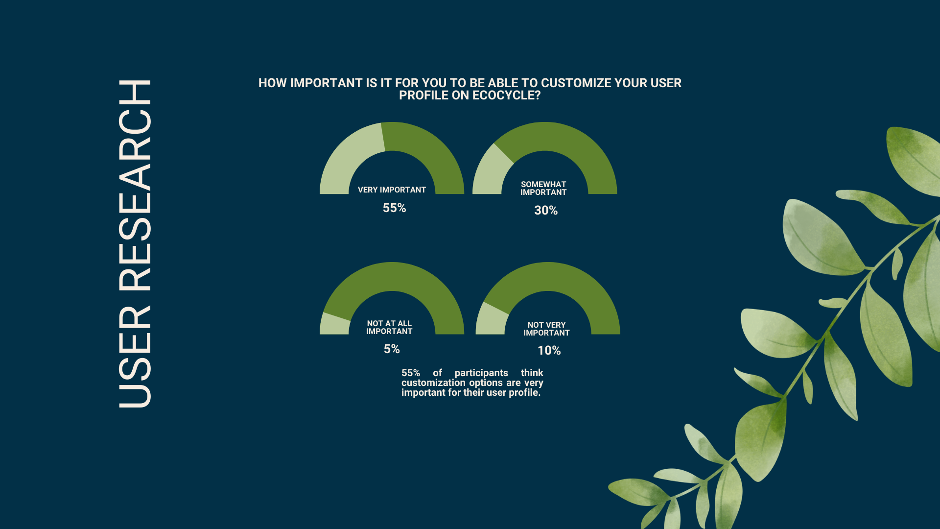
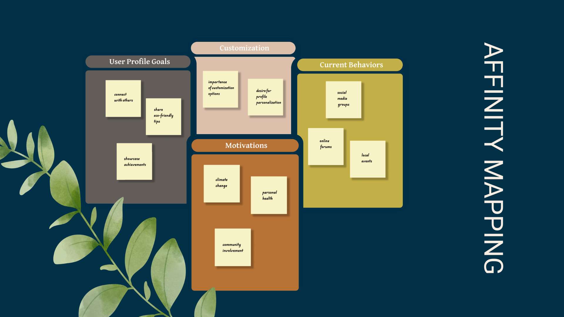
Research Methods: 40 user interviews, Affinity mapping, Persona creation, User journey mapping, Competitive research.
Pain Points: Sustainability information is scattered across multiple platforms; existing communities don't encourage meaningful engagement; users struggle to track and showcase progress; most platforms lack personalized experiences.
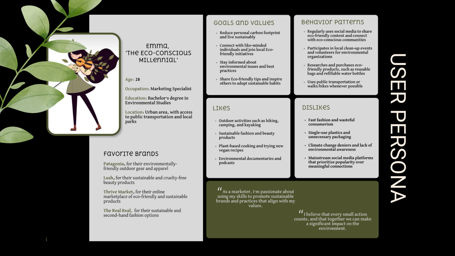
Emma, 'The Eco-Conscious Millennial': Emma regularly uses social media to share eco-friendly content and connect with eco-conscious communities. She participates in local cleanups and volunteer groups, but wants a central space to track her personal achievements and find trusted local resources.
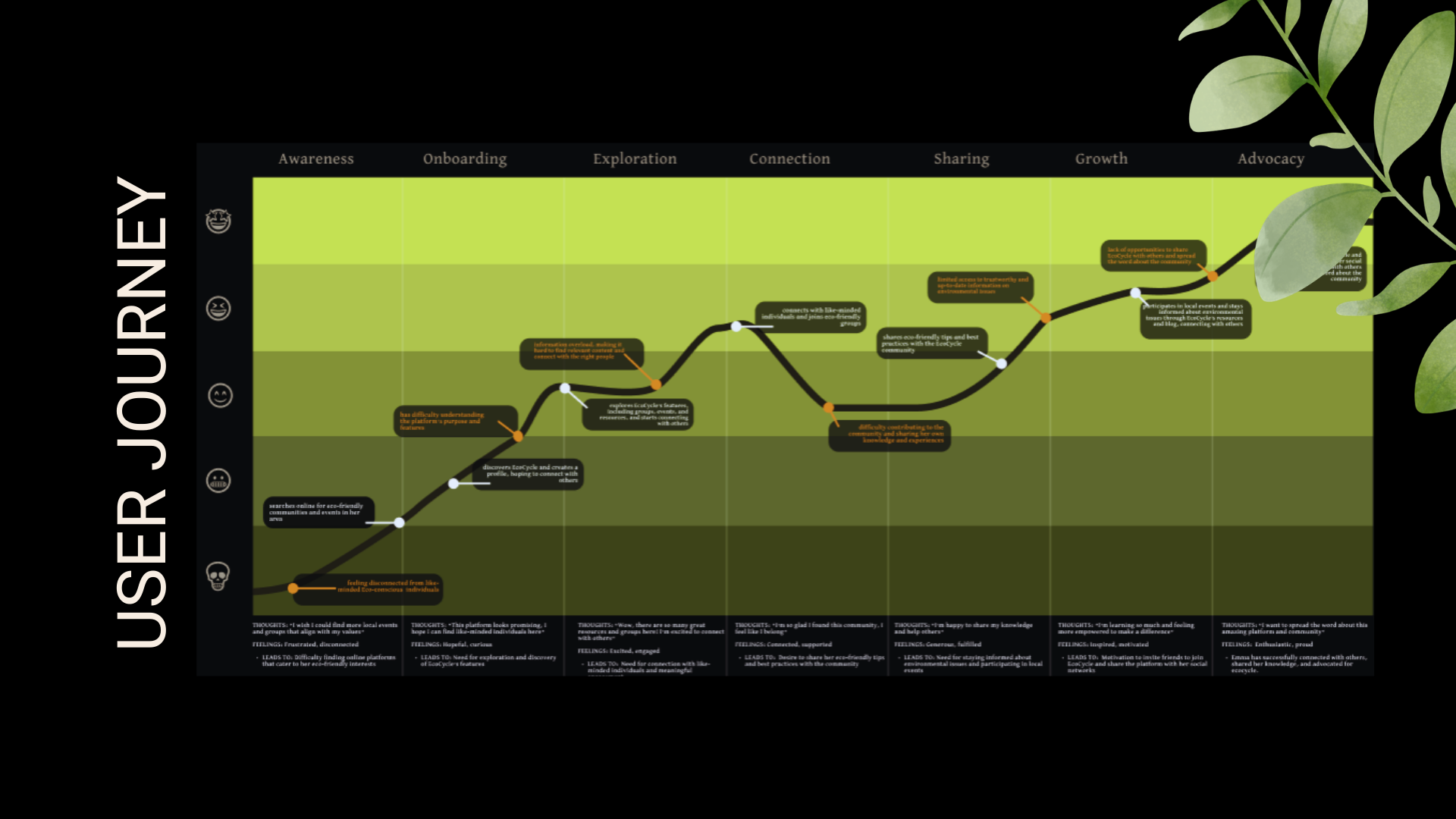
Mapped Emma's journey when trying to find reliable eco-actions, showing how she goes from initial confusion and scattered searches to finding a community, setting her goals, gaining recognition via badges, and sharing them to inspire others.
Guiding Question: How might we design a user profile that showcases eco-friendly achievements, encourages community engagement, and creates a personalized experience that motivates users to stay engaged?
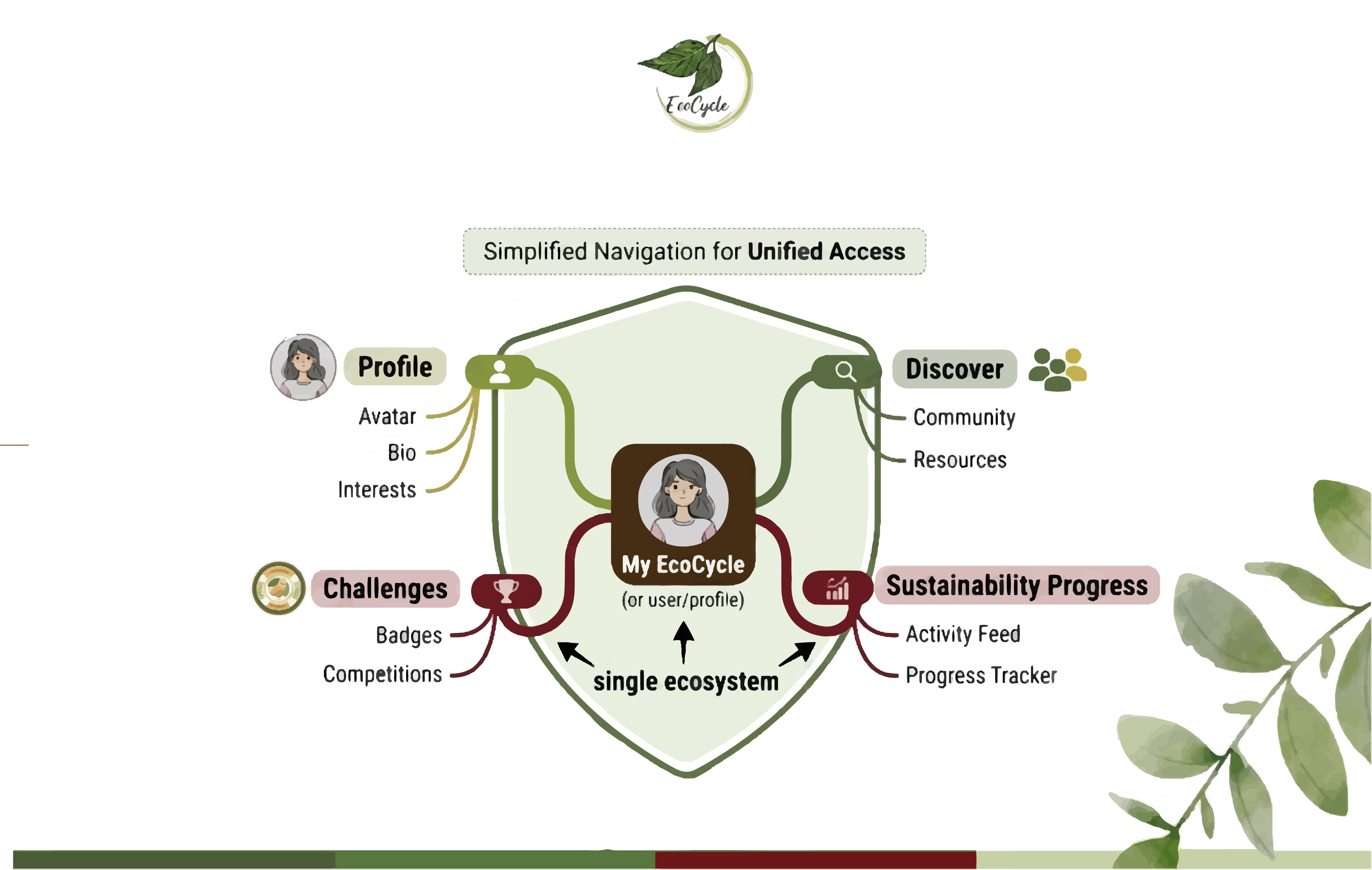
I simplified navigation so users could quickly access their profile, discover community content, participate in challenges, and monitor their sustainability progress from a single ecosystem.
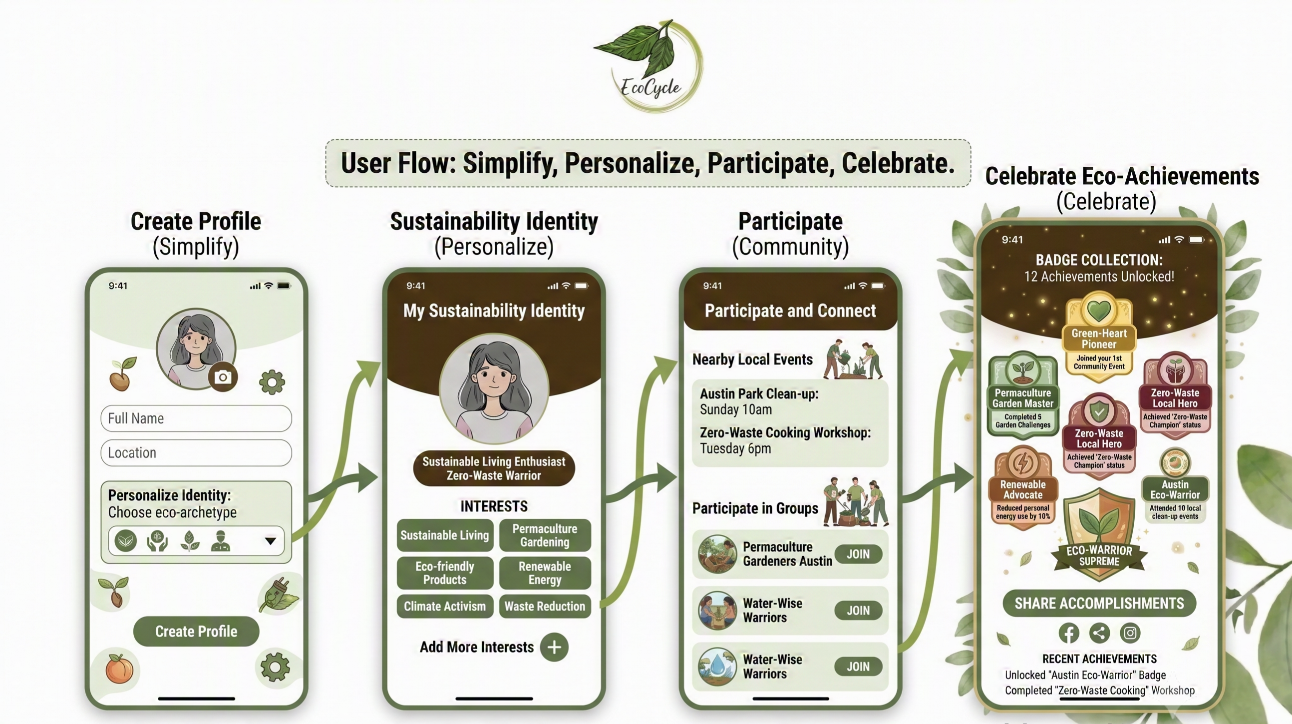
The primary user flow focuses on helping users create a profile, personalize their sustainability identity, participate in community activities, and celebrate achievements.
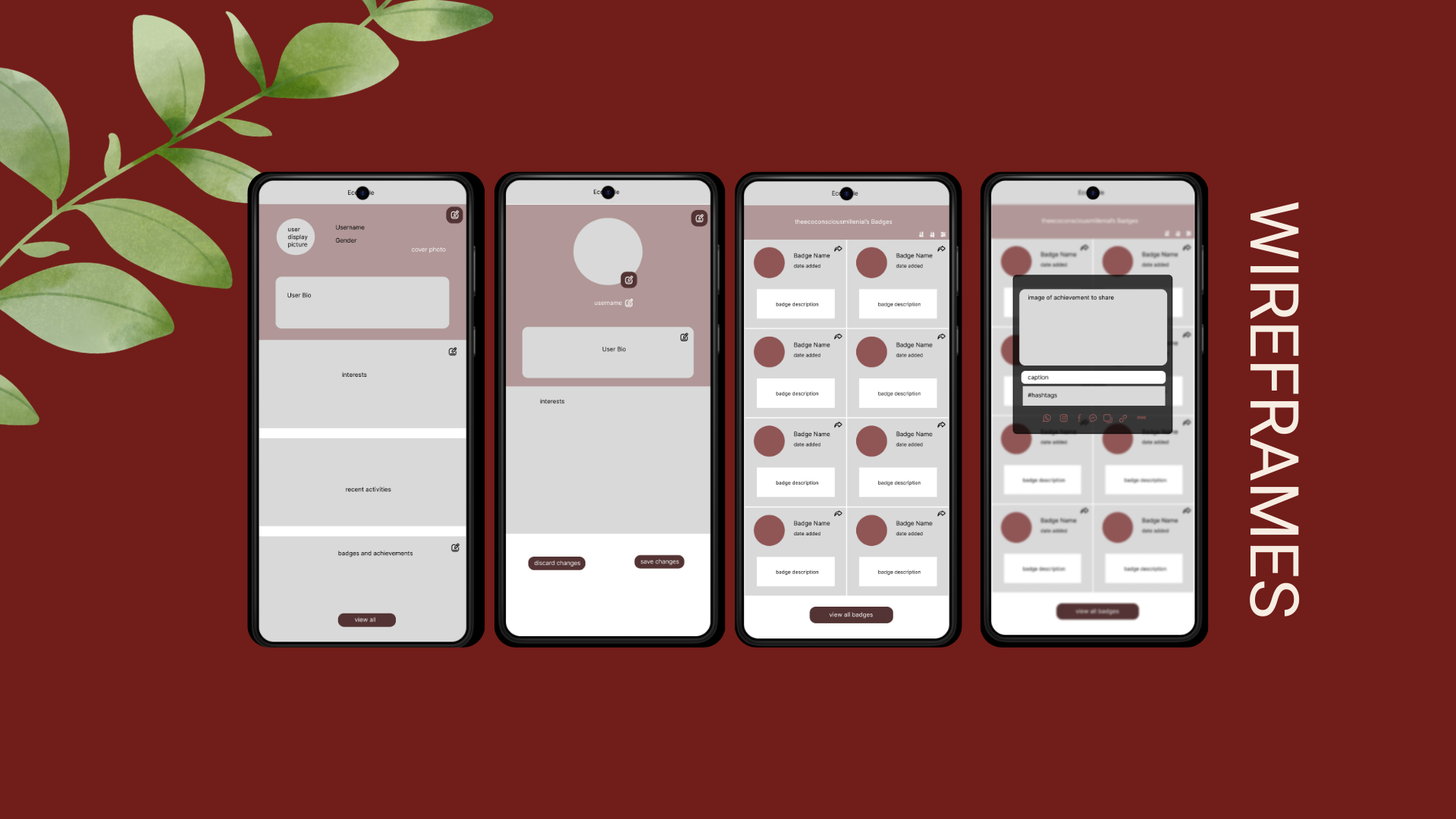
I explored multiple low-fidelity layouts to determine the best balance between personal achievements, community content, and profile customization before moving into high-fidelity designs.
The visual language reflects EcoCycle's mission through: nature-inspired color palette, accessible typography, reusable card components, consistent spacing system, and badge-based achievement patterns.
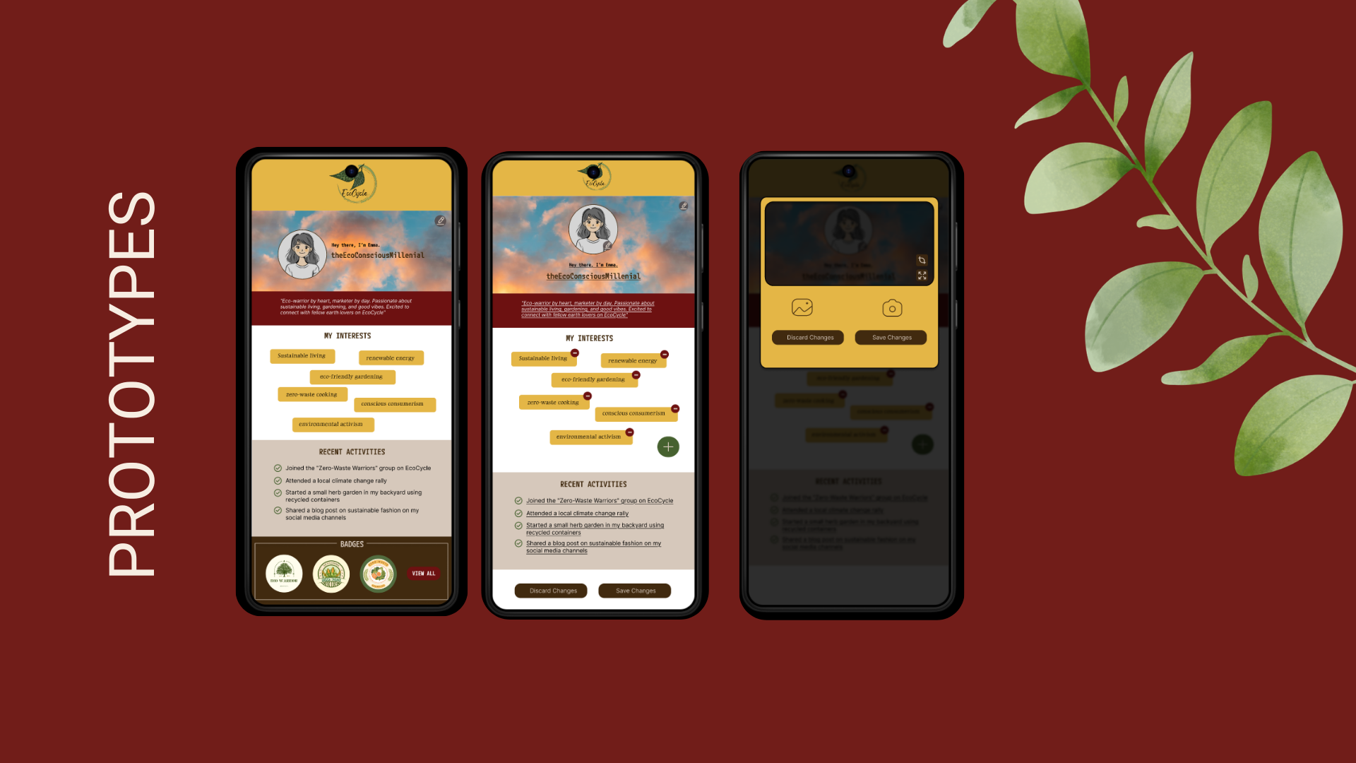
The redesigned profile enables users to personalize their profile, showcase sustainability milestones, share eco-friendly achievements, discover community resources, and connect with people who share similar environmental interests. The experience transforms a static profile into a social hub that encourages long-term participation.
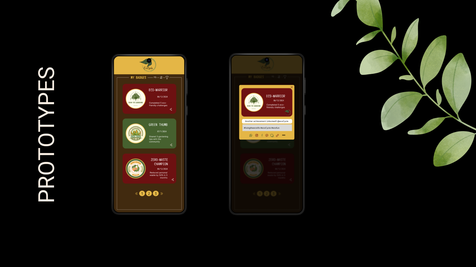
Developed a high-fidelity interactive prototype to demonstrate the onboarding, badge selection, and sharing overlays on mobile viewports.
Conducted usability tests evaluating navigation clarity, task completion rates for setting goals, and the social sharing functionality for unlocked environmental achievements.
This project reinforced that sustainability platforms succeed through community as much as functionality. While users wanted tools to track progress, they were equally motivated by opportunities to connect, learn, and celebrate achievements together. If I continued developing EcoCycle, I would expand the community experience by introducing local events, group challenges, and personalized sustainability recommendations to encourage ongoing engagement.
Bookish | A Minimalist Reading Tracker
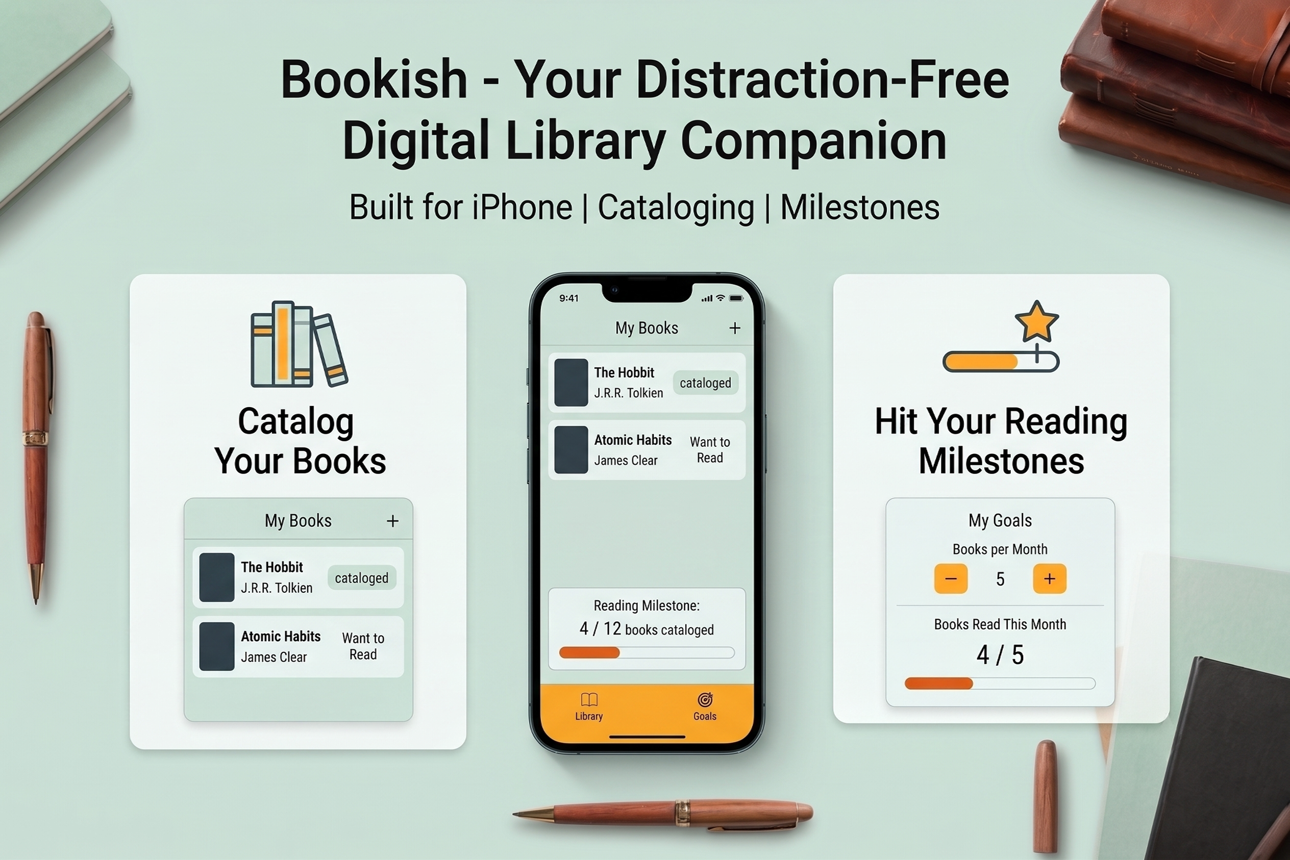
In a world dominated by noisy social reading platforms, Bookish was born out of a desire for simplicity. Built for iPhone using SwiftUI and Xcode, Bookish is a distraction-free digital library companion designed to help readers catalog their books and consistently hit their reading milestones without unnecessary friction.
Role: Solo Product Designer & iOS Developer
Timeline: 4 Weeks
Platform: iOS 17+ (iPhone)
Tech Stack: SwiftUI, SwiftData, Xcode
Modern reading tracking applications suffer from severe feature bloat. Users looking for a simple digital shelf are instead forced through complex social feeds, heavy community gamification, and confusing navigation paths. This turns the quiet, personal habit of reading into an intimidating administrative task, driving users away from tracking their books altogether.
Competitive analysis was conducted on prominent reading trackers (Goodreads, StoryGraph) alongside analogue tracking habits (bullet journaling). Key findings revealed that while power users enjoy extensive data analytics, the average reader abandons these platforms because setting up an entry takes too much effort, and the constant pressure of public social metrics diminishes the intrinsic joy of reading.
Clara, 28 • The Intentional Reader
Bio: A busy marketing professional who reads to unwind before bed.
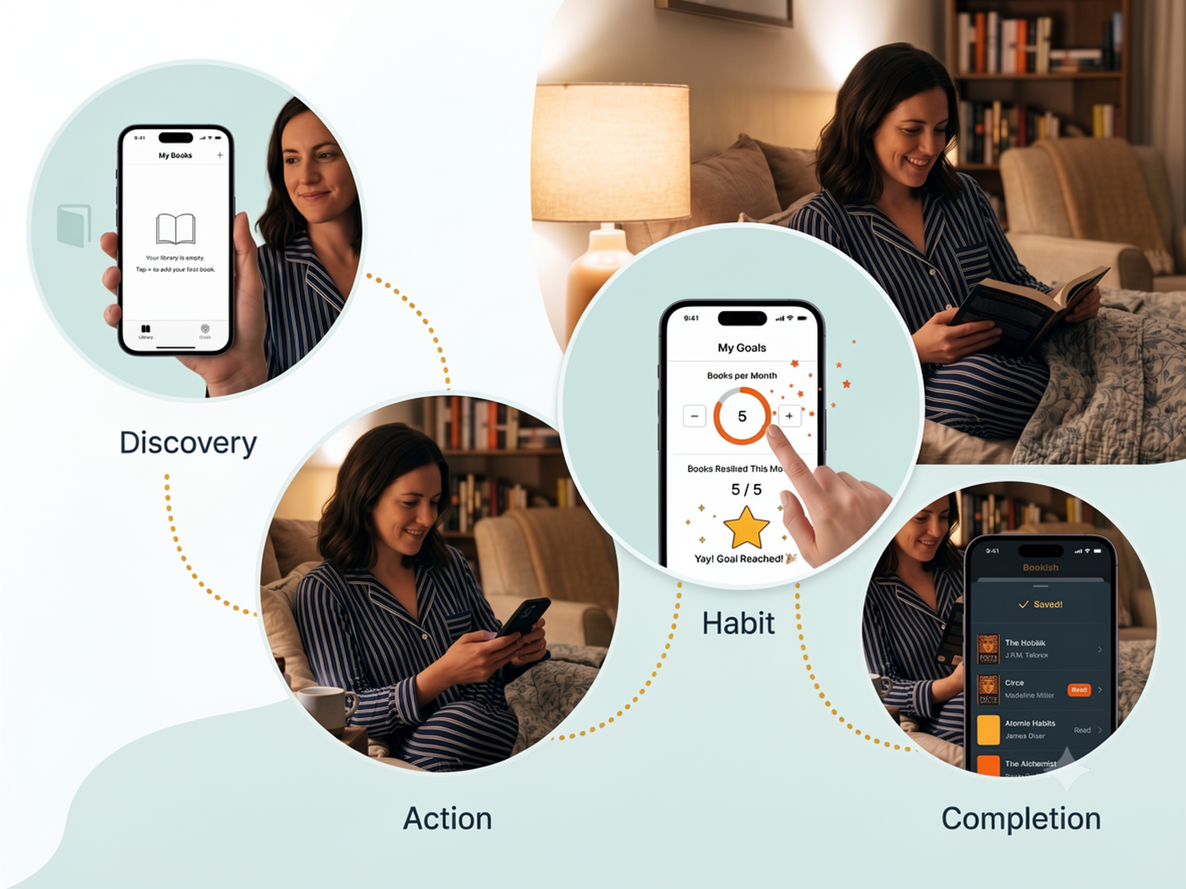
Needs: A clean, private interface to keep track of her stack of bedside books and a light motivational push to read a few pages every night instead of scrolling social media.
Frustrations: Hates cluttered UI, dislikes apps that require setting up an account just to log a single book, and finds public reading challenges performative and stressful.
The application layout relies on a clean, decentralized component tree designed to separate data models, view layouts, and persistent states cleanly within Xcode:
BookTracker (Root) │ ├── 📁 Models │ ├── Book.swift # Core data model entity │ └── BookStatus.swift # Status states (Read, Want to Read, DNF) │ ├── 📁 ViewModels │ └── BookStore.swift # Central state manager & business logic │ ├── 📁 Views │ ├── ContentView.swift # Root tab container │ │ │ ├── 📁 Library │ │ ├── LibraryView.swift # Main library list │ │ ├── AddBookView.swift # New book form modal │ │ ├── EditBookView.swift # Entry modification view │ │ └── BookDetailView.swift # Detailed focus card │ │ │ ├── 📁 Goals │ │ └── GoalView.swift # Progress tracking screen │ │ │ └── 📁 Components │ ├── BookRow.swift # Custom list cell item │ ├── StatusBadge.swift # Context-colored status label │ └── EmptyLibraryView.swift # Onboarding placeholder view │ └── 📁 Helpers & Assets
To support this structure cleanly, I implemented a native SwiftData schema mapping out a flexible, lightweight configuration for our core domain model:
import Foundation import SwiftData @Model final class Book { var title: String var author: String var status: BookStatus var review: String init(title: String, author: String, status: BookStatus = .wantToRead, review: String = "") { self.title = title self.author = author self.status = status self.review = review } } enum BookStatus: String, Codable, CaseIterable { case wantToRead = "Want to Read" case reading = "Reading" case read = "Read" case dnf = "DNF" }
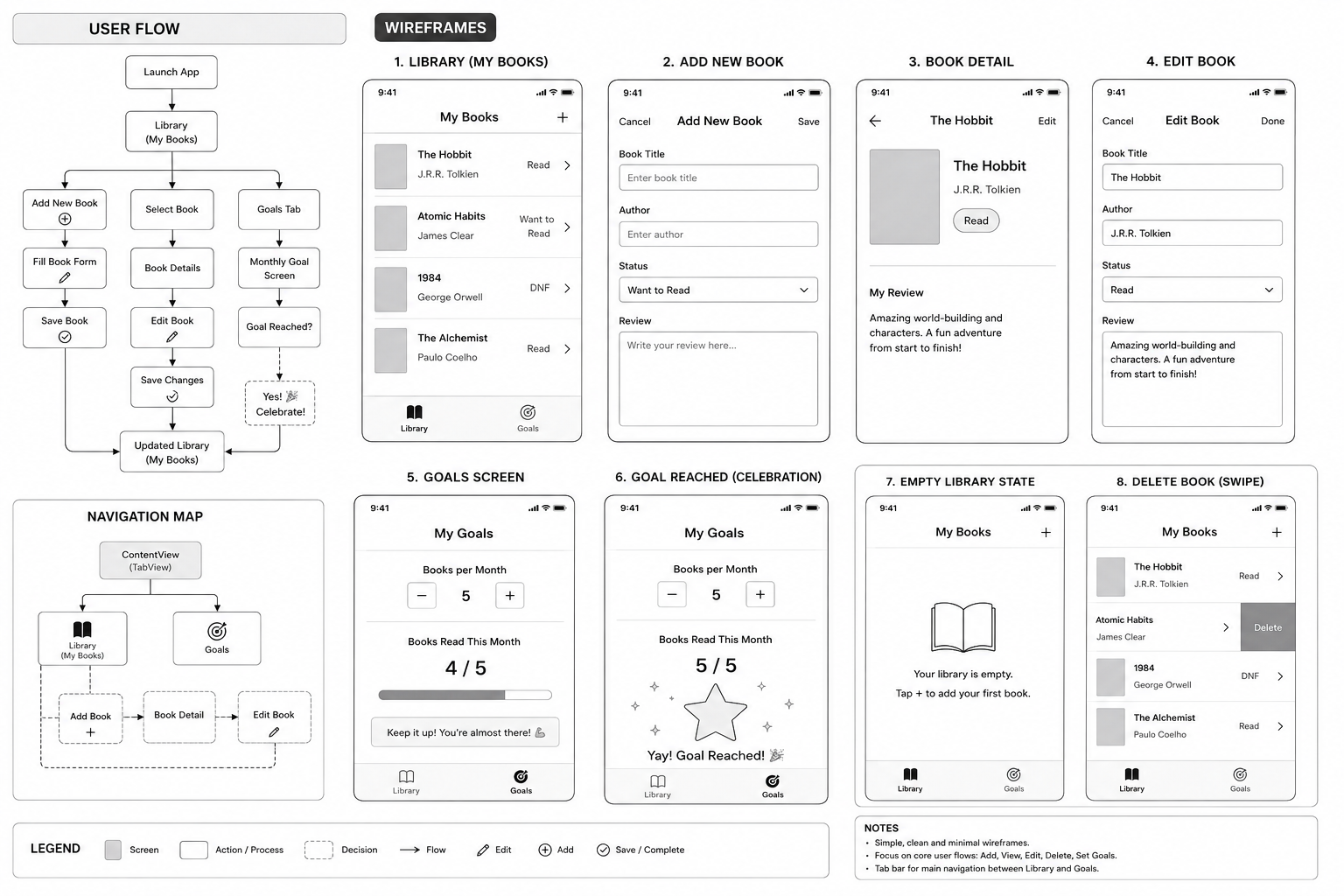
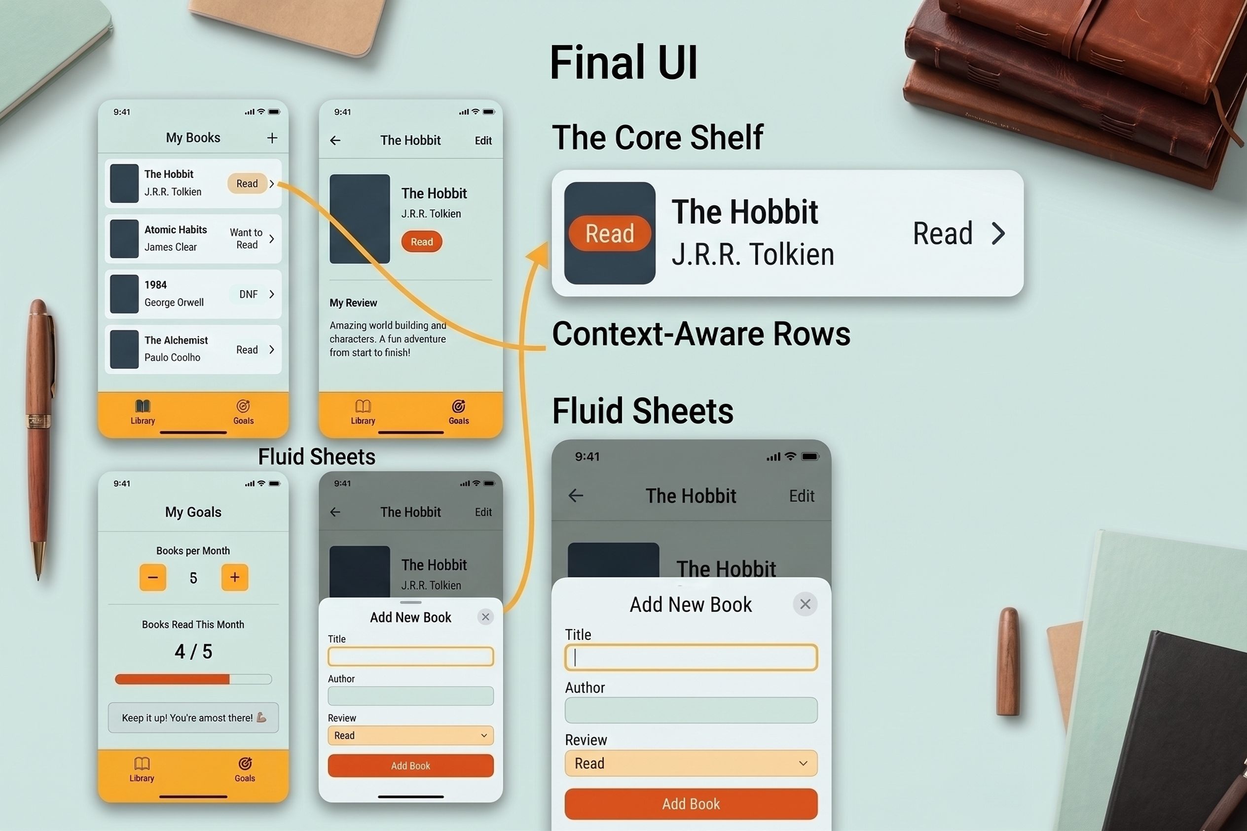
The primary user flows move effortlessly through a persistent, low-profile navigation map. As mapped out in the wireframes, the application is anchored by a two-tab split:
The blueprint layout for Bookish emphasizes clear geometric proportions, generous negative space, and intuitive touch targets. It maps out a consistent, predictable lifecycle for screen interactions:
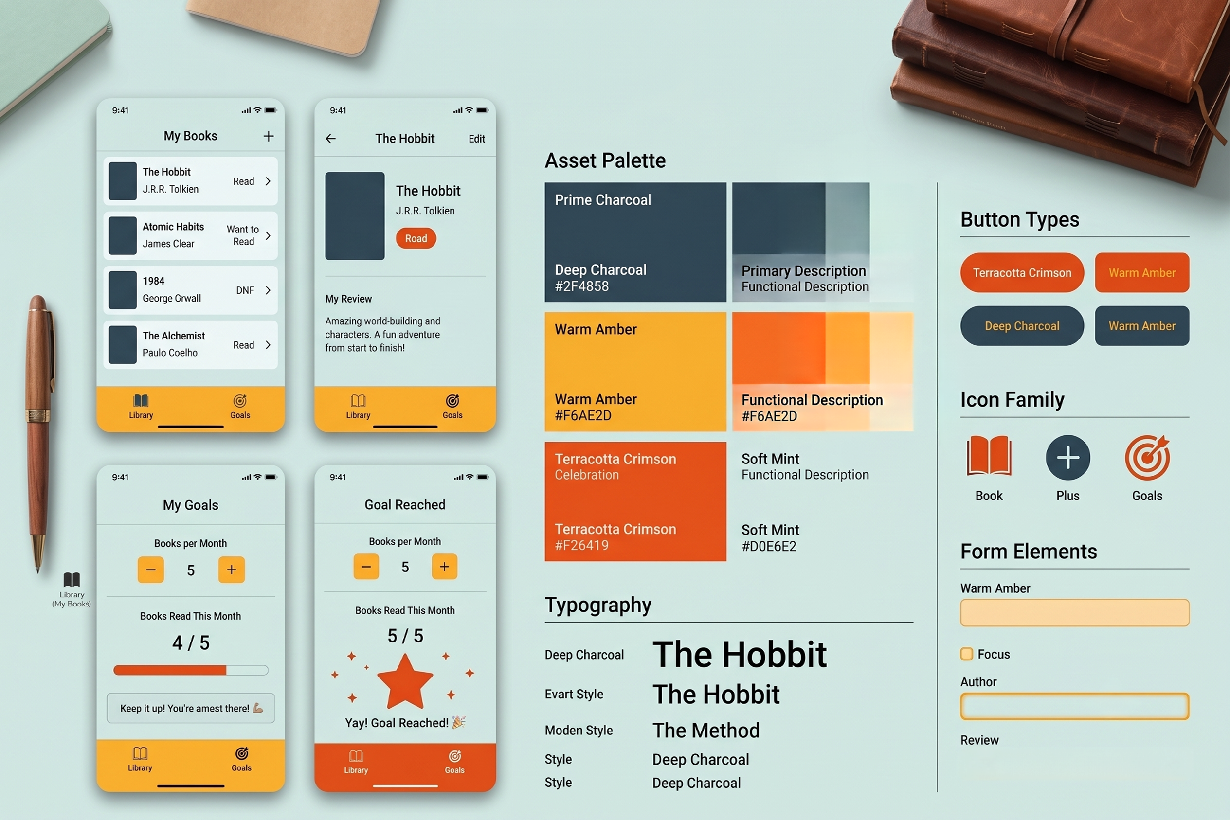
The visual style steps away from harsh stark blacks, choosing instead a warm, calming color spectrum reminiscent of an indie bookstore:
By mapping the layout specifications from wireframes to SwiftUI views, the final interface achieves exceptional visual clarity. To bridge the layout gap between data entry and presentation contexts, I designed a fluid modal sheet utilizing native iOS presentation structures:
struct AddBookView: View { @Environment(\.dismiss) private var dismiss @Environment(\.modelContext) private var modelContext @State private var title = "" @State private var author = "" @State private var status = BookStatus.wantToRead var body: some View { NavigationStack { Form { Section("Book Details") { TextField("Enter book title", text: $title) TextField("Enter author", text: $author) } Section("Status") { Picker("Reading Status", selection: $status) { ForEach(BookStatus.allCases, id: \.self) { status in Text(status.rawValue).tag(status) } } } } .navigationTitle("Add New Book") .toolbar { ToolbarItem(placement: .cancellationAction) { Button("Cancel") { dismiss() } } ToolbarItem(placement: .confirmationAction) { Button("Save") { let newBook = Book(title: title, author: author, status: status) modelContext.insert(newBook) dismiss() } .disabled(title.isEmpty || author.isEmpty) } } } } }
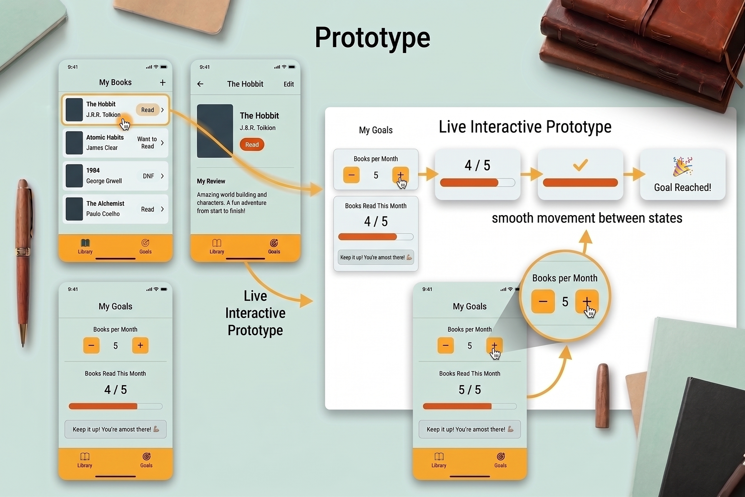
The live interactive prototype was built directly inside Xcode using SwiftUI's powerful live canvas previews. Transitions are incredibly fast, passing state data bindings between views automatically:
Usability testing was conducted with a pool of five target readers using an Xcode simulator environment.
Button("Save Changes") {
// 1. Commit the active local UI bindings directly to SwiftData Context
try? modelContext.save()
// 2. Resolve testing ambiguity by triggering physical hardware confirmation
let generator = UINotificationFeedbackGenerator()
generator.notificationOccurred(.success)
dismiss()
}
Building Bookish highlighted the incredible harmony between product design and modern engineering workflows. Utilizing SwiftUI allowed for rapid iteration, transforming wireframes into clean, declarative code with minimal middleware. By focusing exclusively on fundamental user needs and avoiding feature creep, Bookish proves that a highly specialized, lightweight app can provide a far more rewarding experience than a massive, overcrowded platform.
Designing a solo travel experience that feels safe, personal, and empowering
YonderLust is a conceptual mobile app that helps solo travelers discover destinations, plan itineraries, and explore confidently through a personalized, safety-focused experience. The project was completed as a two-day design sprint to explore how thoughtful product design can reduce travel anxiety while preserving the excitement of independent travel.
Solo travel offers freedom and self-discovery, but planning a trip alone can also feel overwhelming. Safety concerns, itinerary planning, and the uncertainty of exploring unfamiliar places often discourage people from traveling independently.
Role: Product Designer
Duration: 2-Day Design Sprint
Tools: Figma • FigJam • Illustrator
Deliverables: User Research • User Flow • Wireframes • Design System • High-Fidelity Prototype
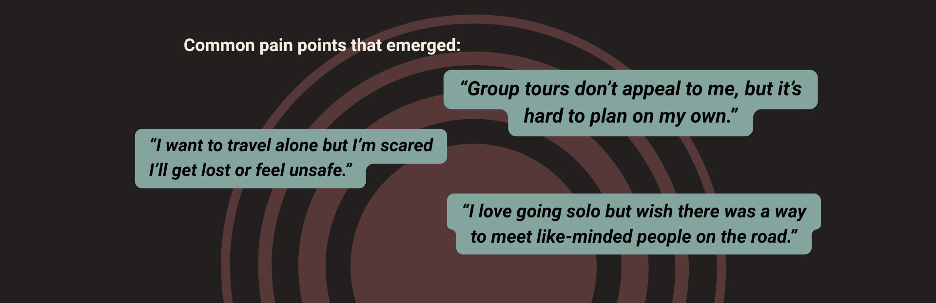
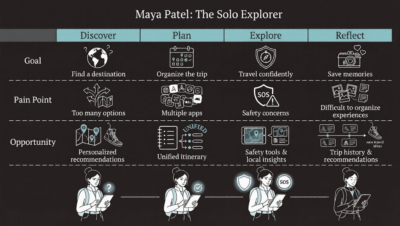
Solo travelers face three recurring challenges:
Most travel apps prioritize bookings rather than the emotional needs of solo travelers, leaving users to manage planning, safety, and discovery on their own.
Although this was a two-day sprint, I grounded the design in qualitative research by reviewing travel communities and existing products. My research methods included: analysis of Reddit solo travel discussions, travel blog comments, App Store / Google Play reviews, and competitive analysis of existing travel applications. These sources helped identify common frustrations and unmet user needs.
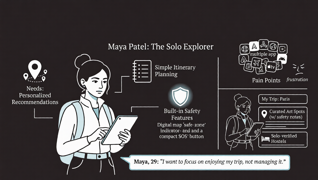
Maya Patel, 29 • The Solo Explorer
Goal: Plan safe, personalized solo trips without juggling multiple apps.
Pain Points: Trip planning feels overwhelming; safety is a constant concern; information is scattered across different platforms.
Needs: Personalized recommendations, simple itinerary planning, and built-in safety features.
"I want to focus on enjoying my trip, not managing it."
Key Design Opportunity: How might we simplify solo travel planning while helping users feel confident and safe throughout their journey?
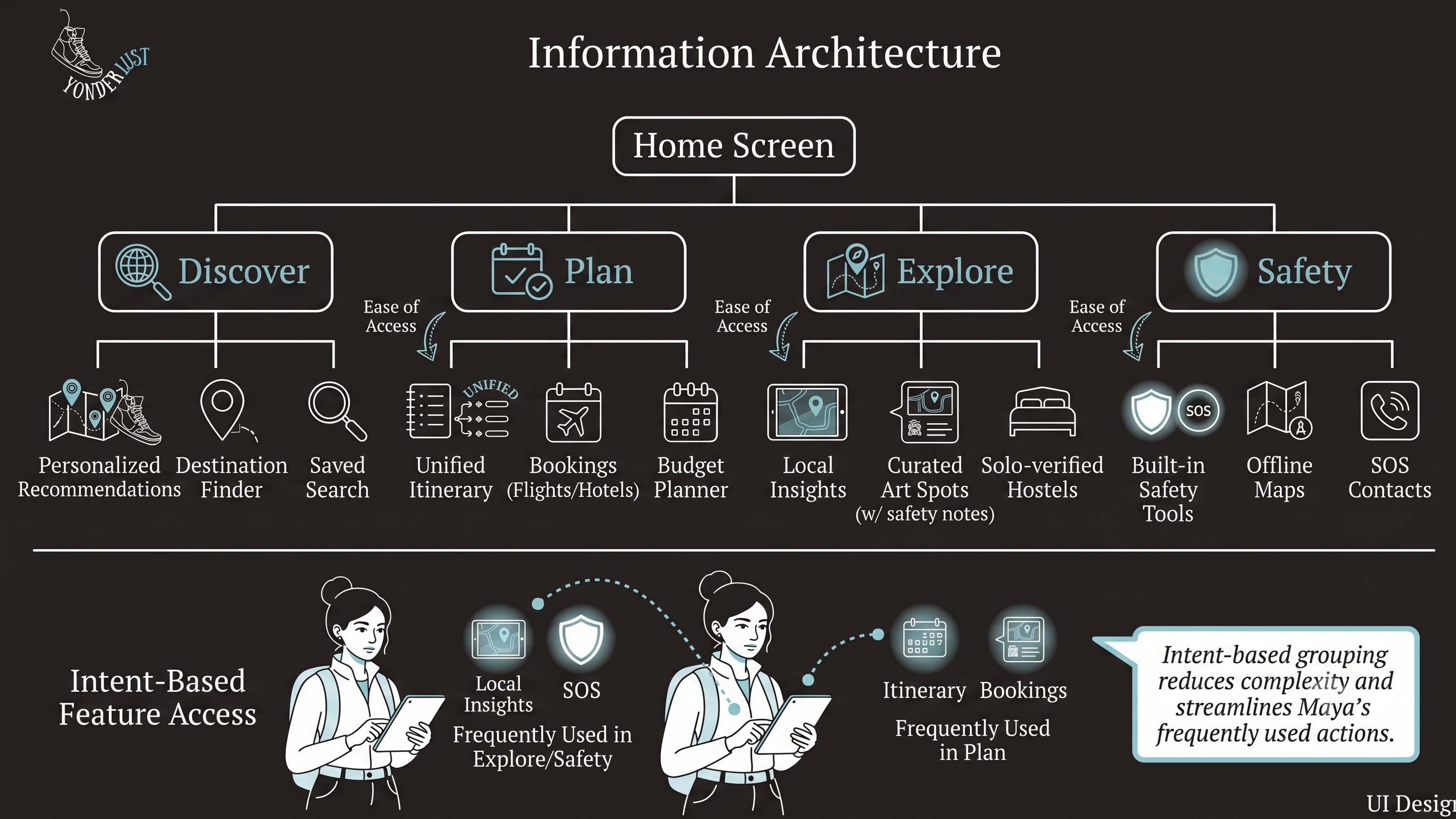
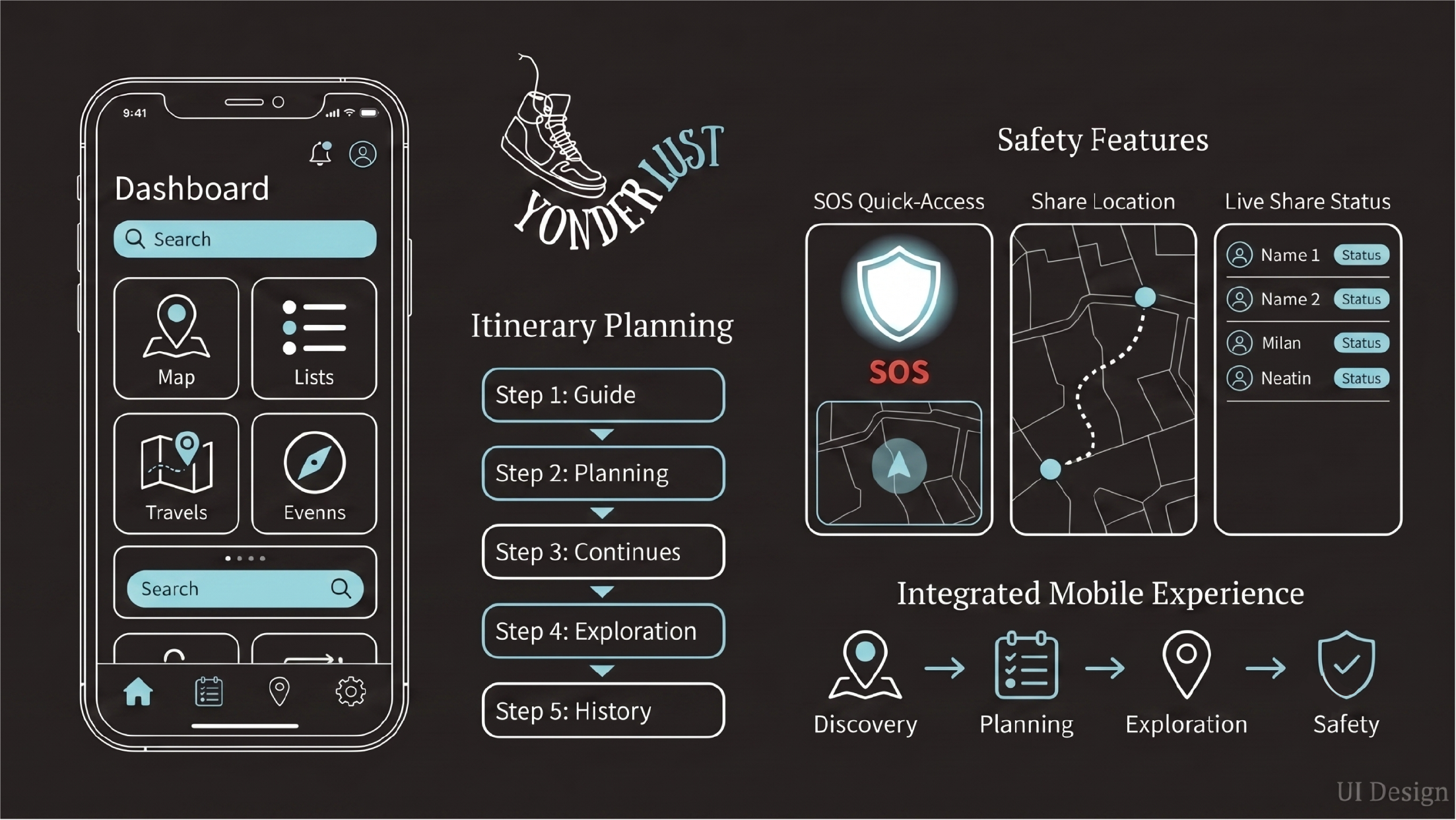
The sitemap was organized around discover, plan, explore, and safety. Grouping features by intent reduced navigation complexity and made frequently used actions easier to access.
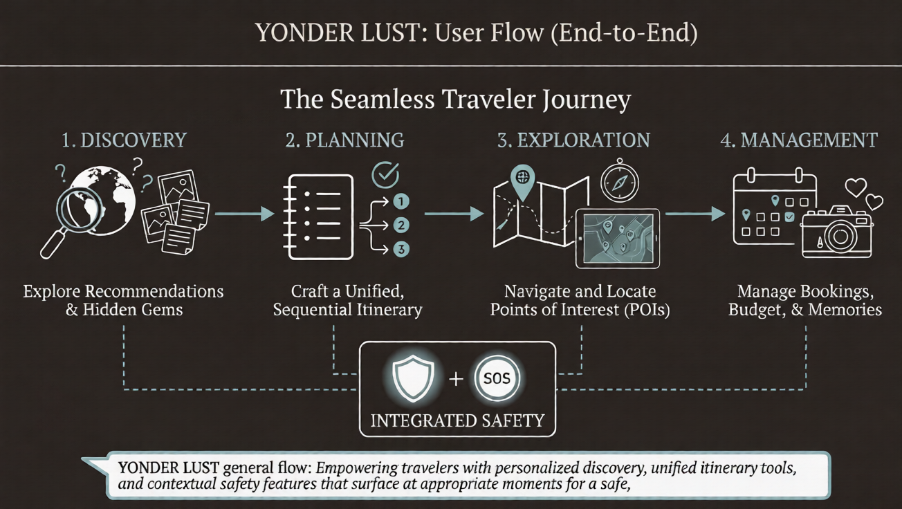
The primary flow follows a traveler from destination discovery through itinerary planning, exploration, and trip management while surfacing safety features at appropriate moments instead of interrupting the experience.
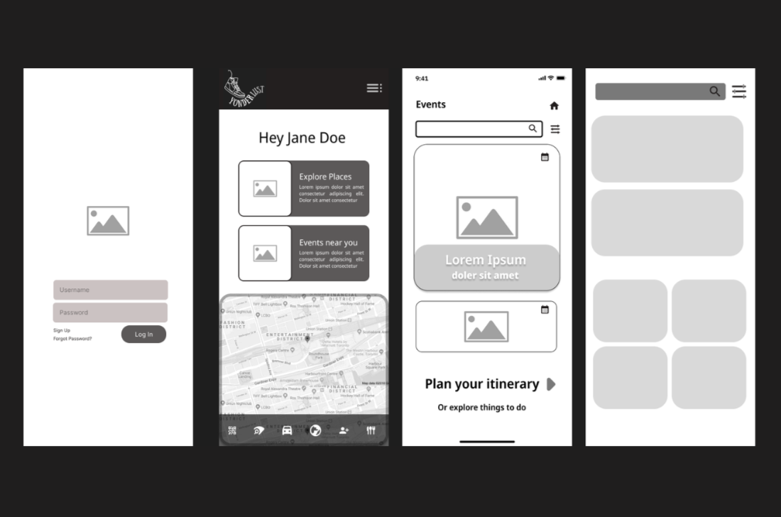
Early wireframes focused on layout, hierarchy, and navigation. I explored structures centered around a personalized home dashboard, interactive map exploration, a visual itinerary builder, and persistent access to safety features.
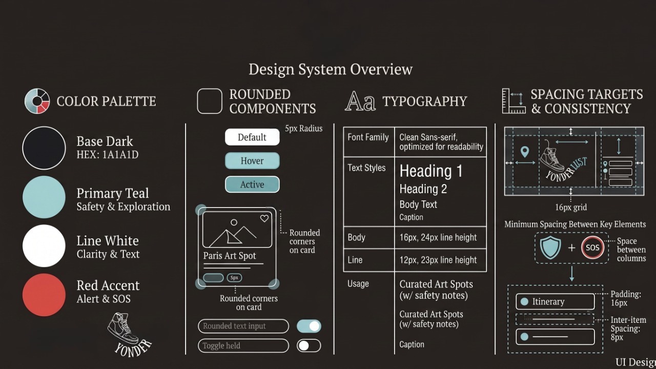
The visual language was intentionally calm and approachable to reinforce trust: soft teal palette to communicate safety and exploration, rounded components for a welcoming interface, clear typography, and consistent spacing targets.
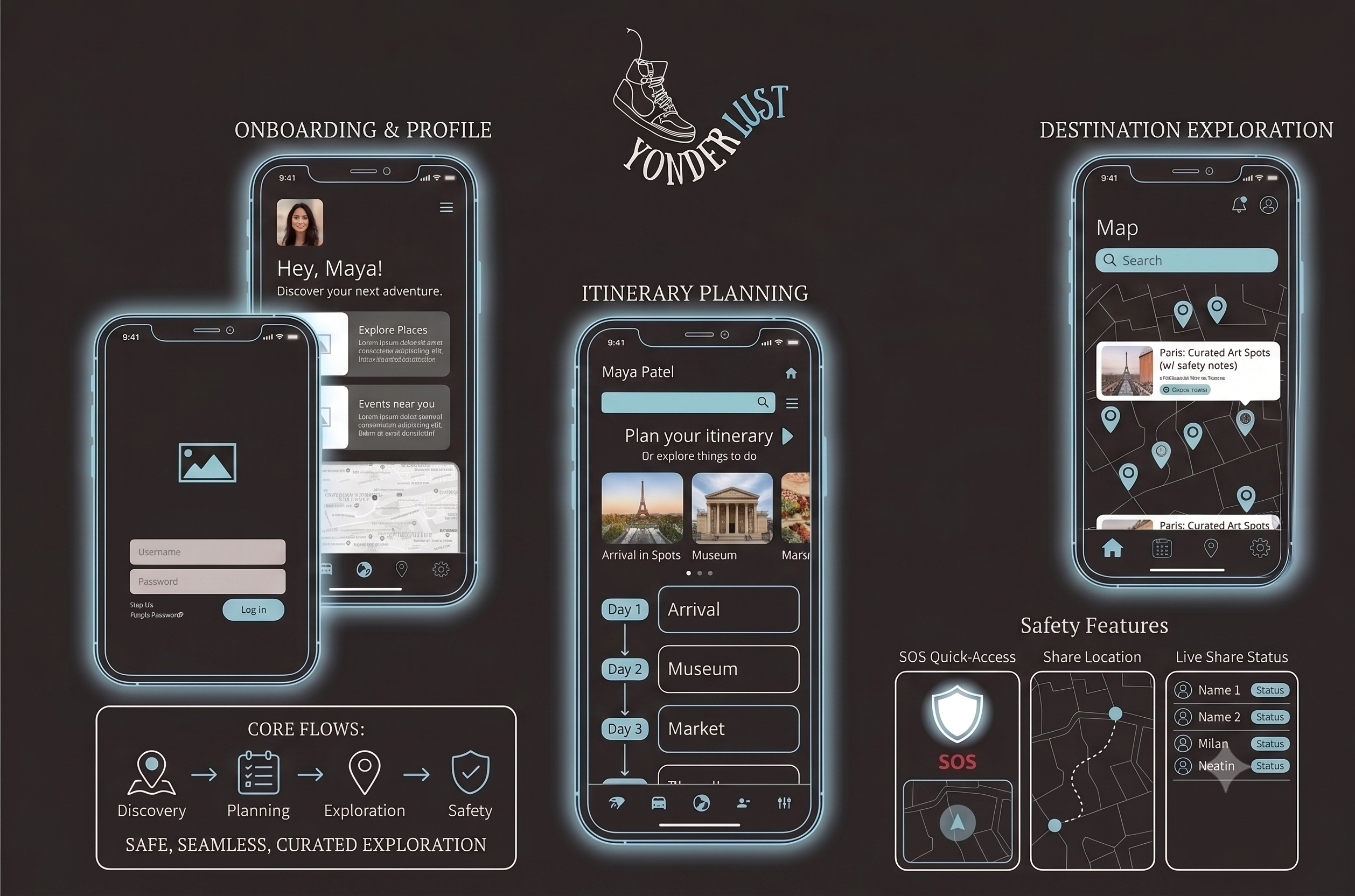
The final prototype combines itinerary planning, destination discovery, and safety features like emergency contacts, live location sharing, and quick-access SOS functionality into one cohesive mobile experience.
The prototype demonstrates Maya's core travel planning experience from onboarding through itinerary creation and destination exploration.
Due to the project's two-day timeframe, formal usability testing wasn't conducted. Instead, I iterated on the interface using research insights, heuristic evaluation, and continuous design reviews throughout the sprint. Future iterations would include moderated usability testing to validate navigation and feature discoverability with solo travelers.
This project reinforced that designing for travel extends beyond booking experiences. Solo travelers need products that reduce uncertainty while preserving the excitement of exploration. If I continued developing YonderLust, I would expand the product with AI-powered itinerary recommendations, community features for connecting with fellow travelers, and location-based safety insights to create a more personalized and supportive travel experience.
Designing a luxury fashion brand through editorial storytelling
Luxury fashion is built on more than products. Every touchpoint, from the logo to packaging and digital experiences, shapes how customers perceive the brand.
AURA is a conceptual luxury fashion brand inspired by celestial storytelling, combining editorial aesthetics with contemporary elegance to create a cohesive identity across print and digital experiences.
Role: Brand Experience Designer
Duration: 2 Weeks
Tools: Adobe Illustrator • Photoshop • InDesign
Deliverables: Brand Strategy • Visual Identity • Editorial Lookbook • Style Guide • Packaging Concepts • Digital Brand Guidelines
Create a premium fashion brand that feels emotionally engaging and visually distinctive while maintaining consistency across every customer touchpoint, from editorial layouts to packaging and digital experiences.
AURA is positioned as a luxury fashion house where contemporary elegance meets celestial fantasy. Every design decision reinforces the brand's core values of artistry, emotion, elegance, authenticity, and imagination, creating an immersive and memorable brand experience.
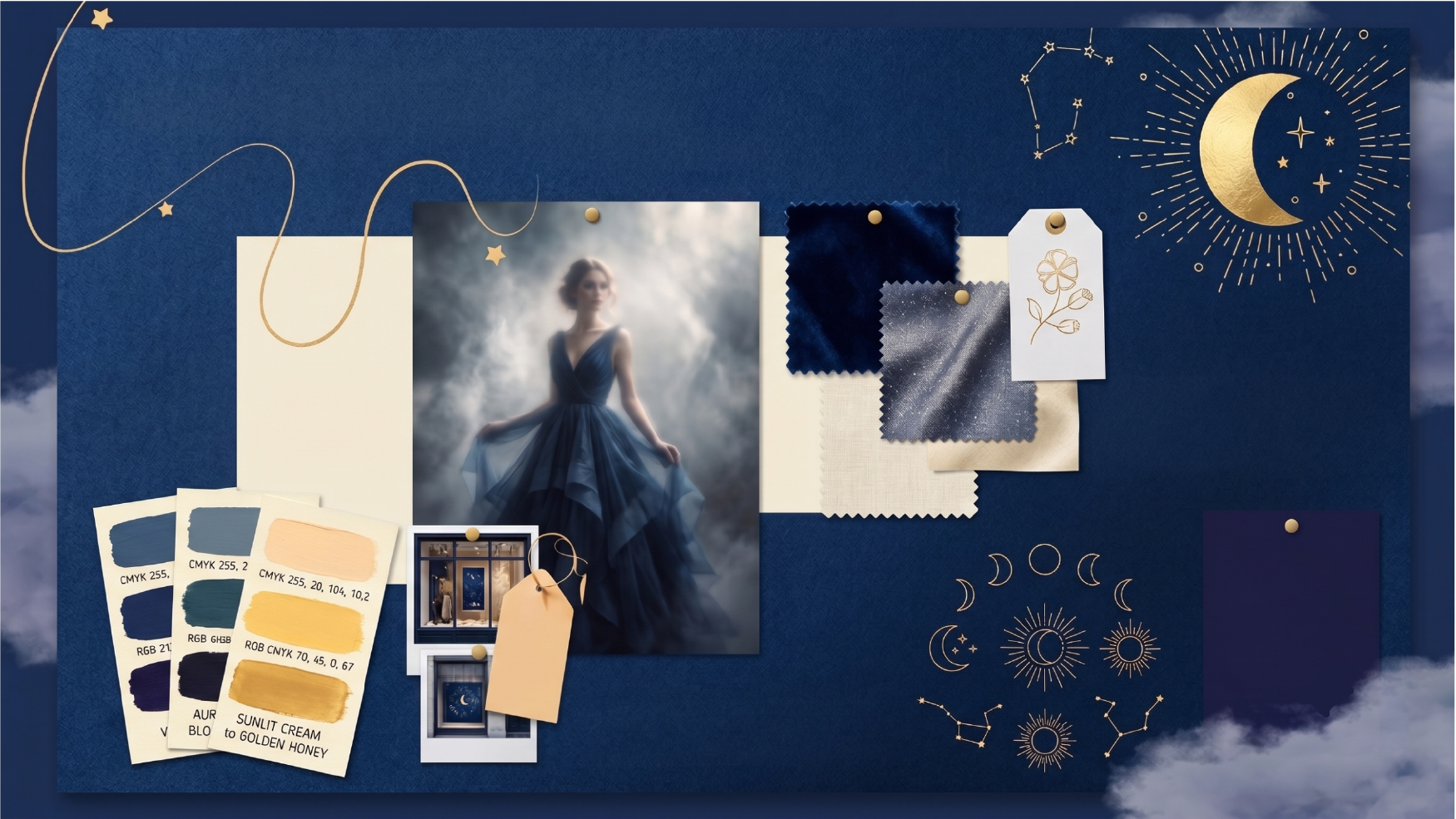
The visual direction draws inspiration from celestial landscapes, soft lighting, and editorial fashion photography.
Design Principles: Celestial-inspired storytelling, elegant editorial layouts, premium typography, rich atmospheric color palette, and minimal yet expressive compositions.
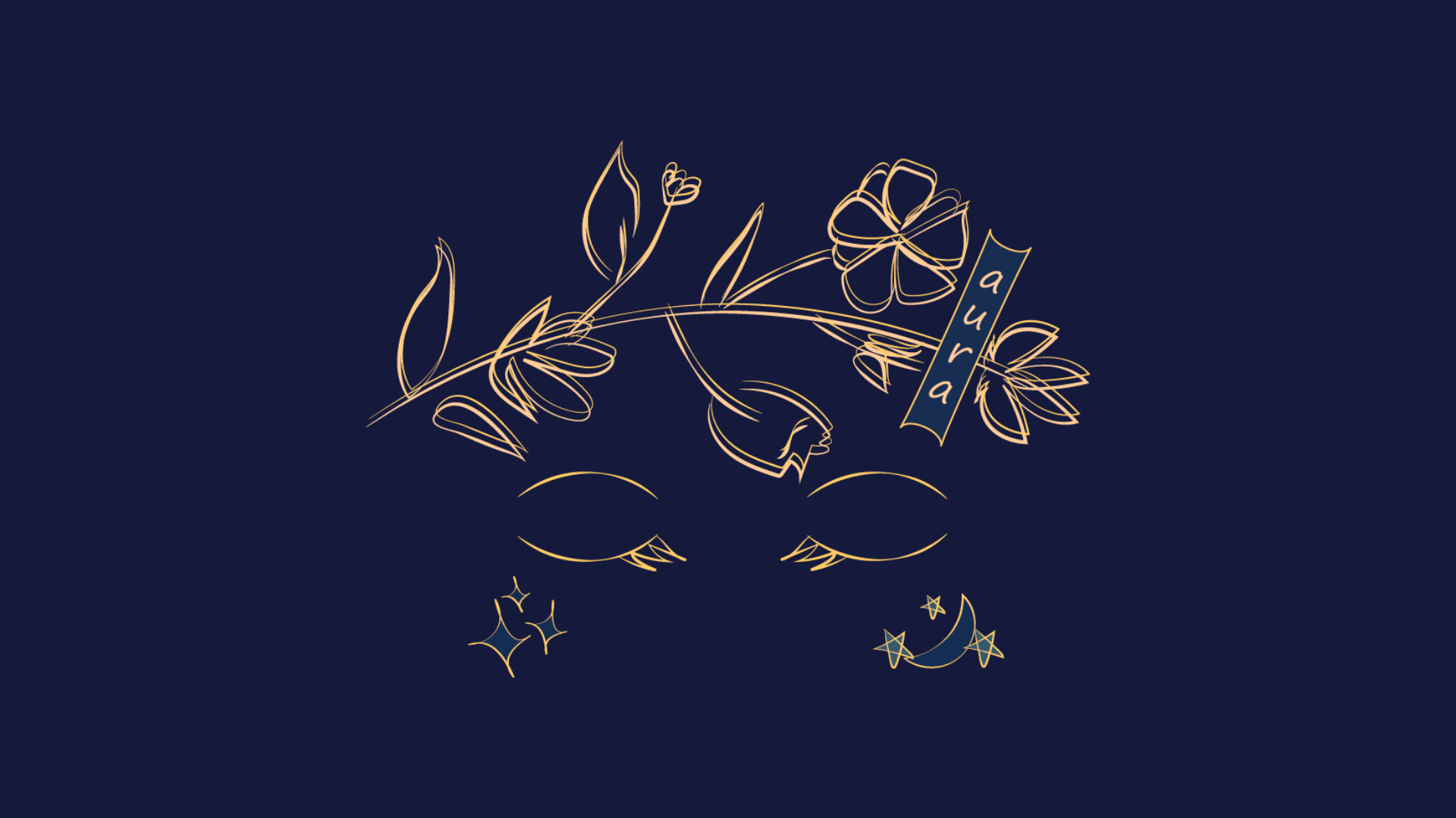
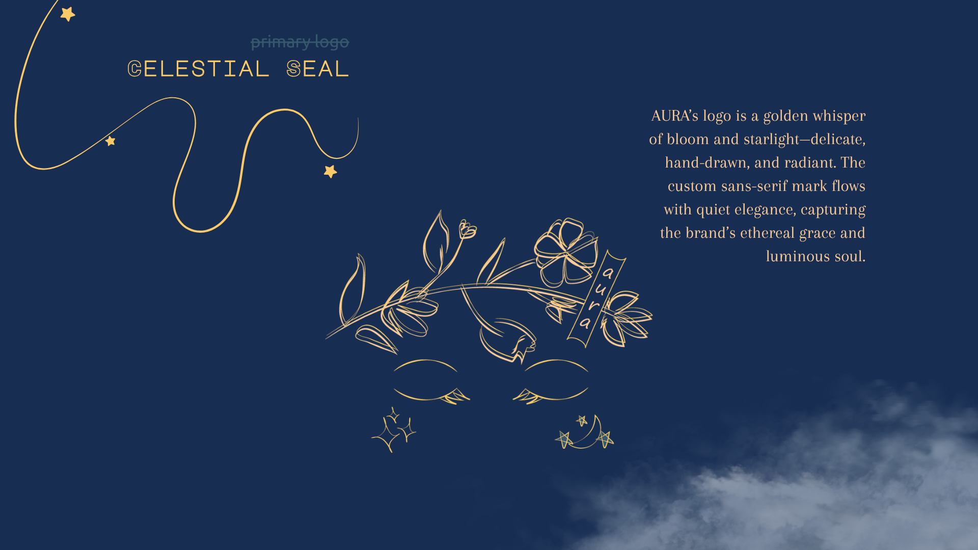
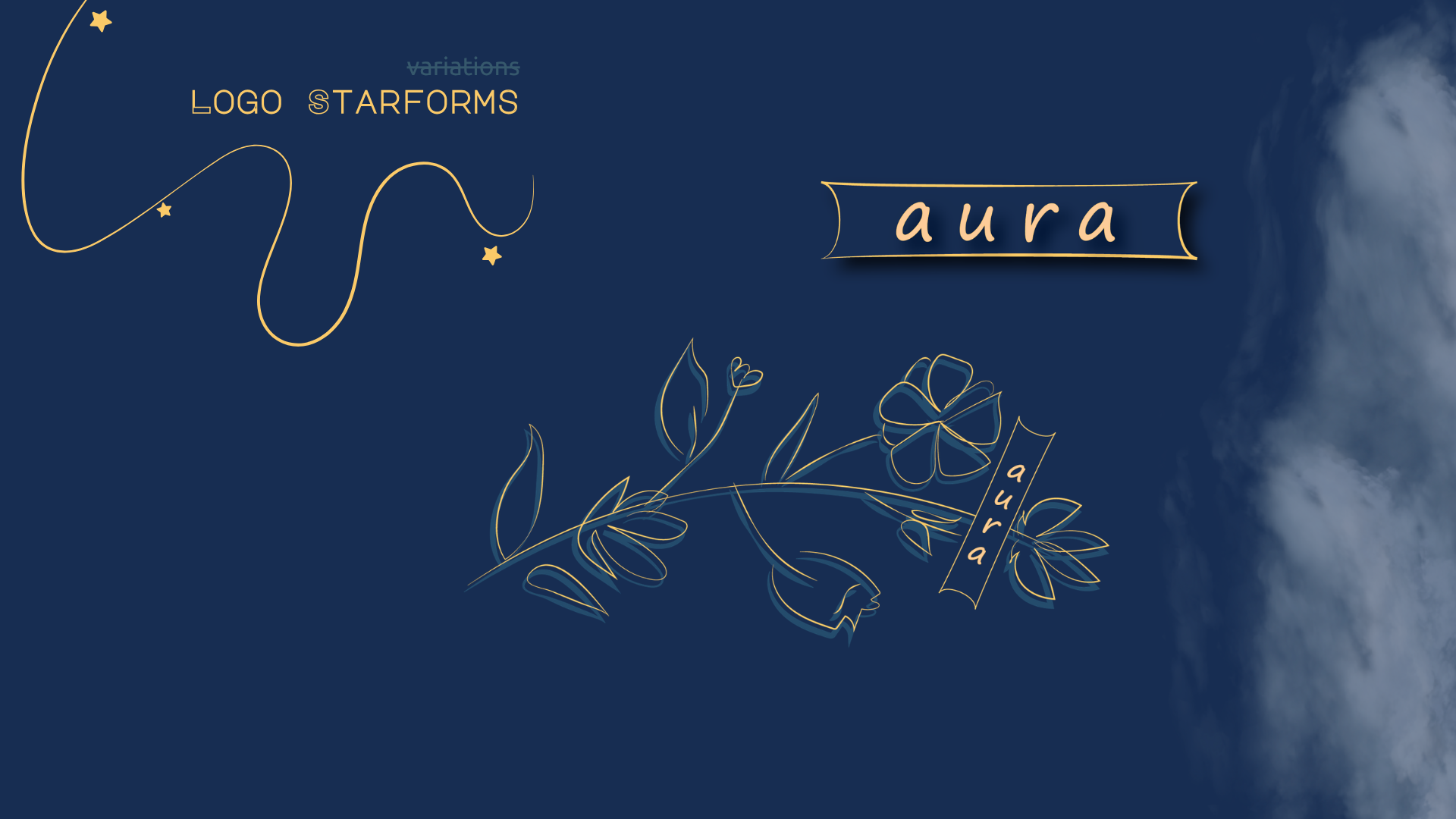
The custom wordmark reflects AURA's ethereal personality through refined typography and hand-crafted details, creating a timeless identity that feels both modern and luxurious.
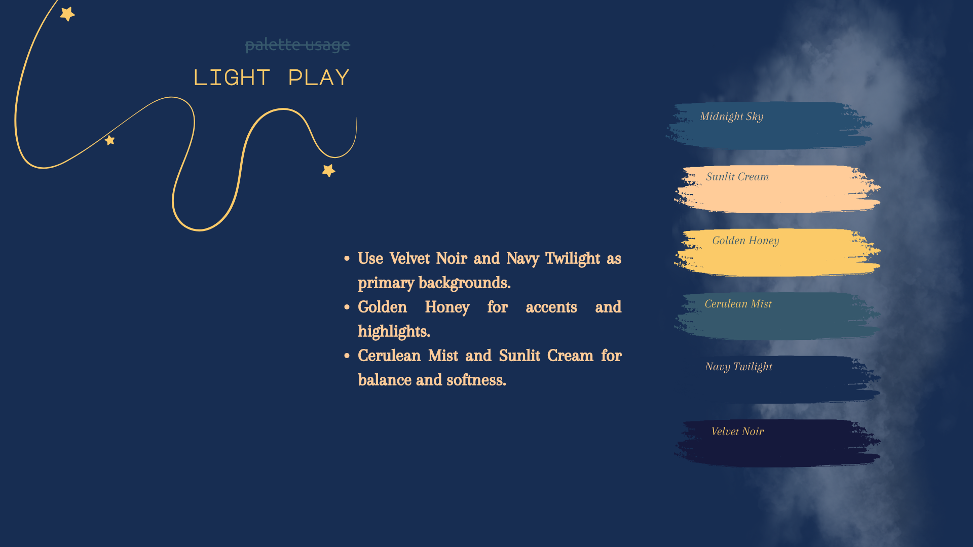
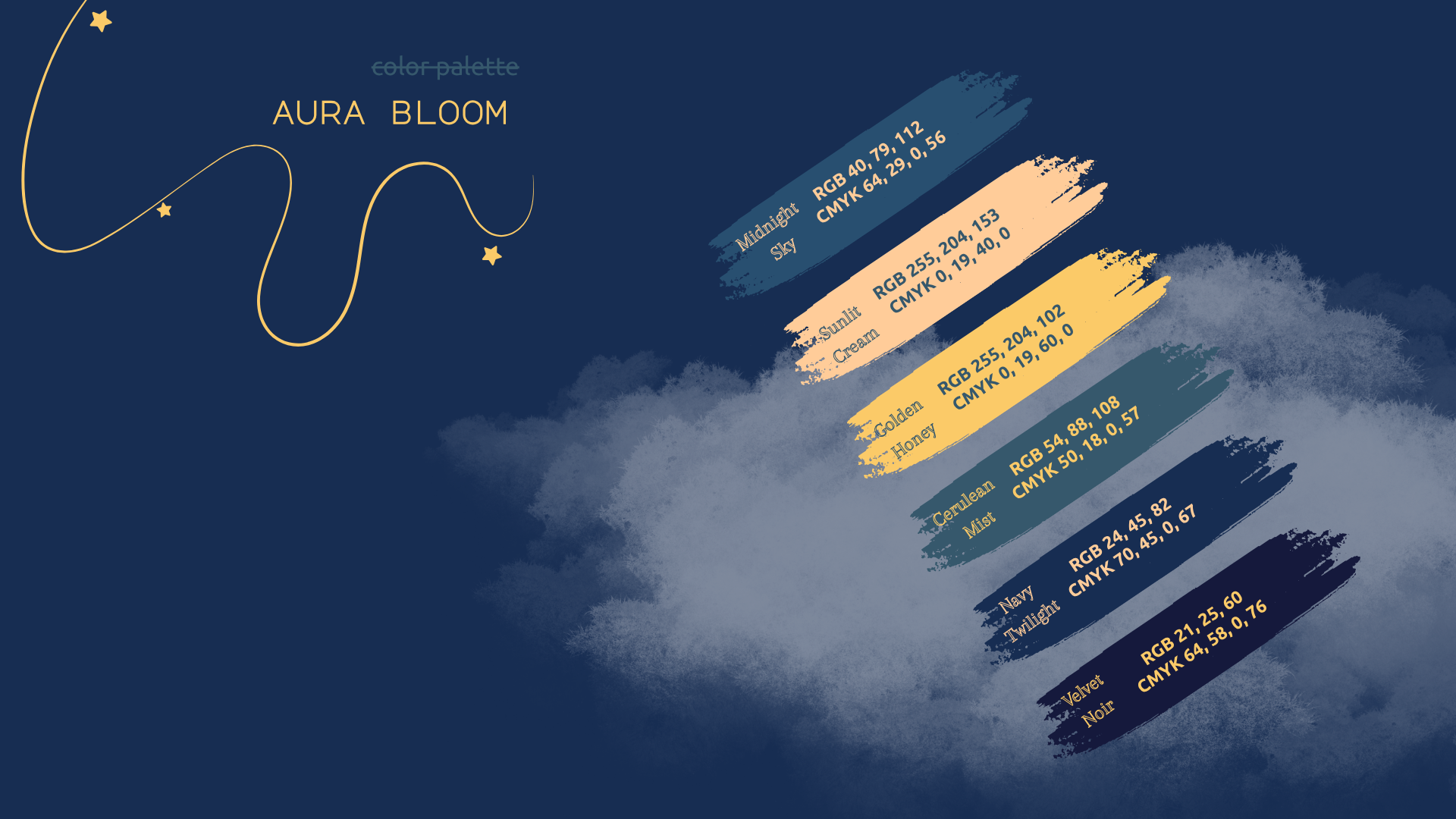
The palette combines deep navy tones with warm gold accents and soft neutrals to evoke mystery, elegance, and celestial beauty while maintaining strong visual contrast across print and digital applications.
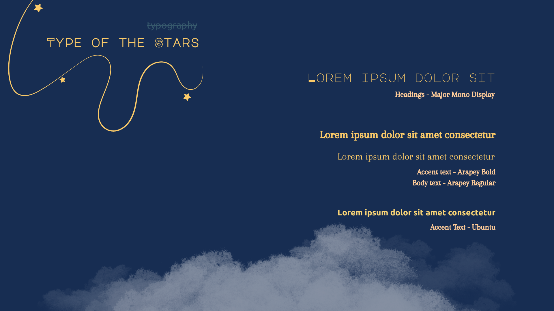
A combination of Major Mono Display, Arapey, and Ubuntu establishes a clear visual hierarchy while balancing editorial sophistication with readability across different media.
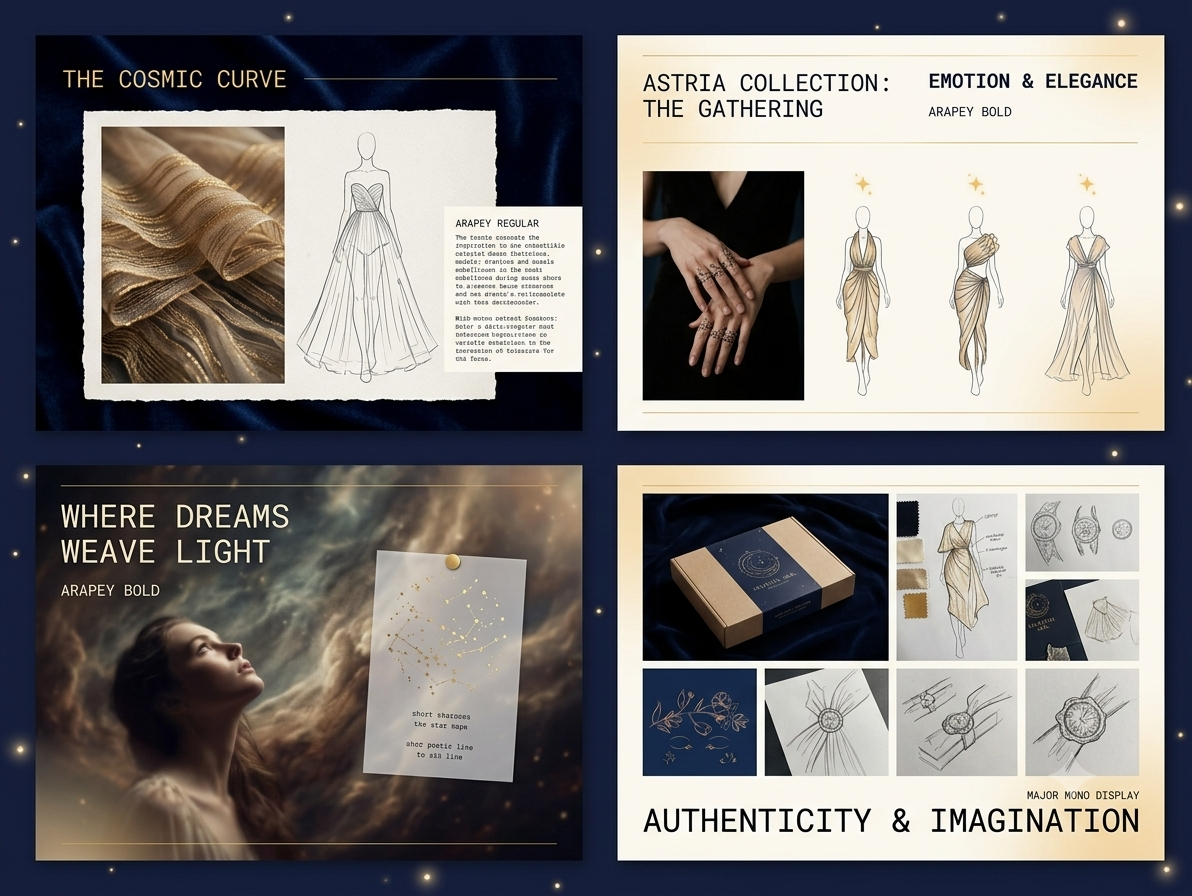
To create a cohesive storytelling experience, I developed a flexible editorial system that includes: grid-based layouts, consistent typography hierarchy, full-bleed imagery, generous whitespace, and fashion illustrations integrated with photography. This system ensures visual consistency while allowing each collection to communicate its own narrative.
The identity extends beyond print into multiple customer touchpoints.
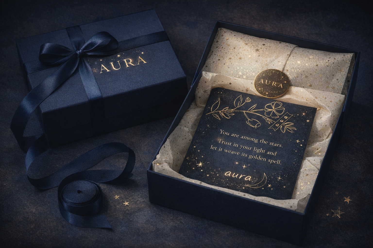
Designed premium packaging featuring navy boxes, gold foil branding, patterned tissue paper, and poetic message cards to reinforce the unboxing experience.
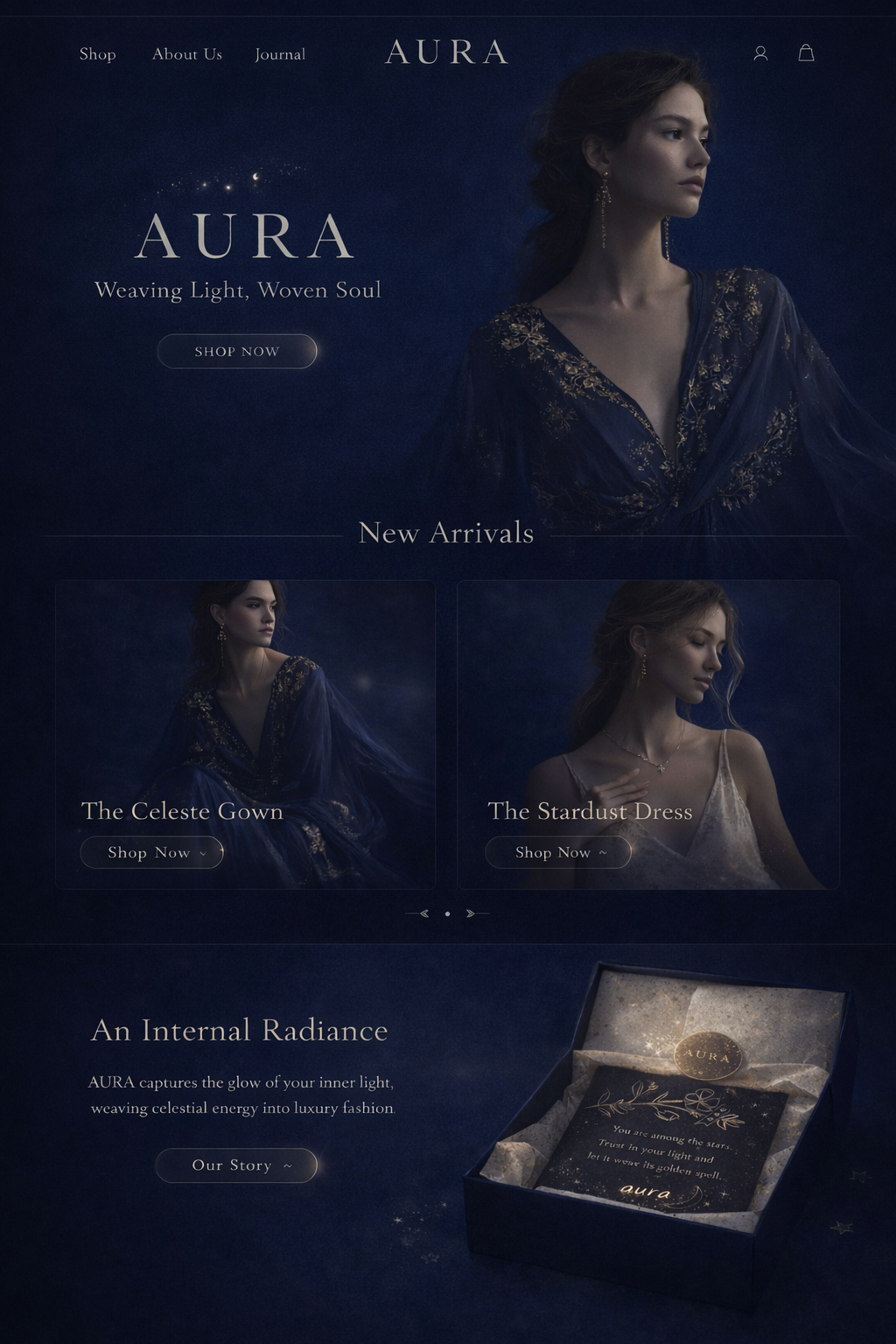
Created guidelines for editorial web layouts, social media content, iconography, and interface elements to ensure the brand remains consistent across digital platforms.
Developed merchandising concepts inspired by celestial environments, incorporating ambient lighting, layered fabrics, and constellation-inspired displays to create an immersive in-store experience.
AURA strengthened my ability to design beyond individual assets and think holistically about brand experience. Building a complete identity system reinforced how consistency, storytelling, and thoughtful design decisions shape how people perceive a brand across physical and digital touchpoints.
If I expanded the project, I would design a responsive ecommerce experience, interactive digital lookbook, and comprehensive design system to extend the brand seamlessly into a modern online retail experience.